There are two ways of setting up a Bootstrap 4 Navbar on your page.
Using the predefined navbar templates.
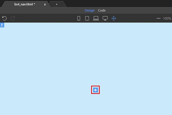
Click the add button in Design View:
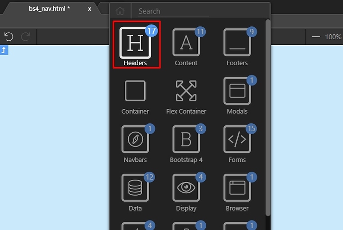
Open the Headers category:
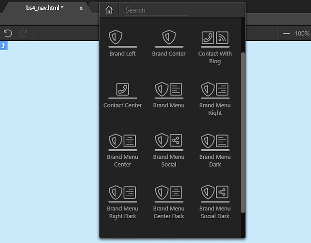
You will find the different navbar templates here. Just select any of them and it will be added on the page. Then you can customize its options:
Create a navbar from scratch.
Click the add button in Design View:
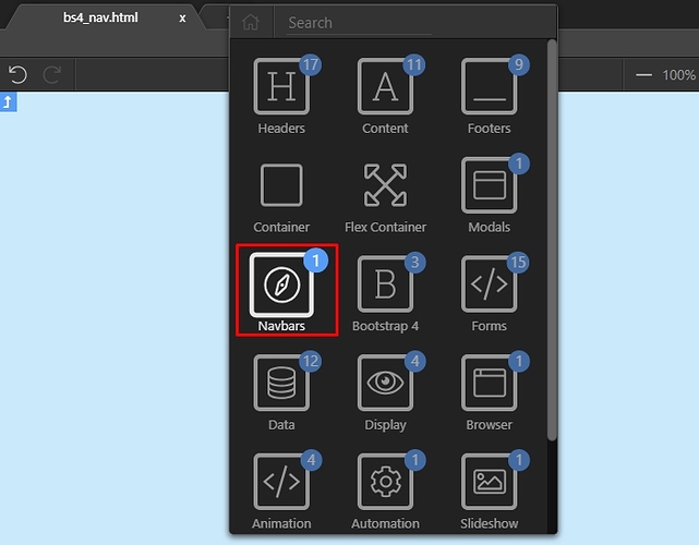
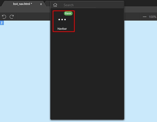
Open the Navbars category:
Add Navbar:
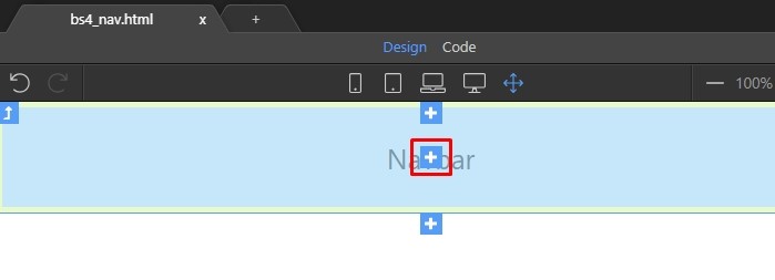
Click the add inside button in order to add content inside the Navbar:
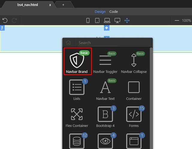
And add Navbar Brand:
Double click it to edit its default content and enter your brand name there:
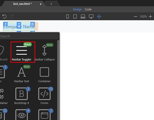
After the brand we need to add the Navbar Toggler element and the collapse region which it toggles. While the brand element is selected, click the Add After button:
Select Navbar Toggler:
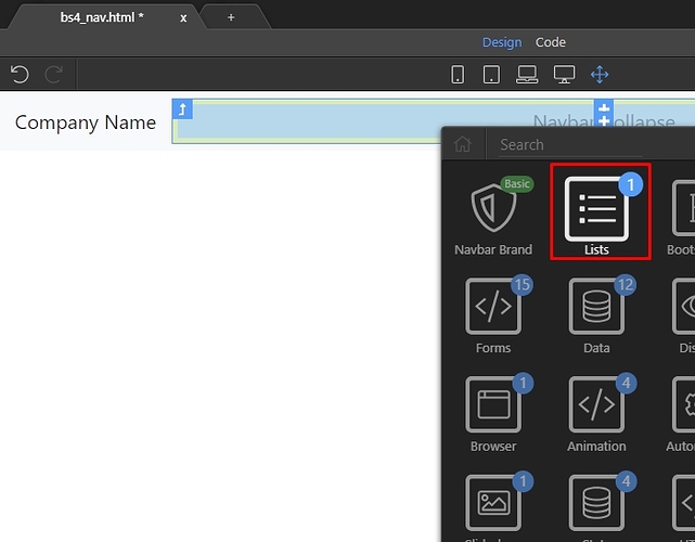
The toggler element also adds the collapse, which holds our navigation links. Click the add inside collapse element button:
Open the lists category:
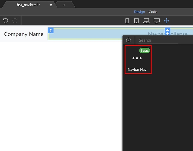
Add Navbar Nav:
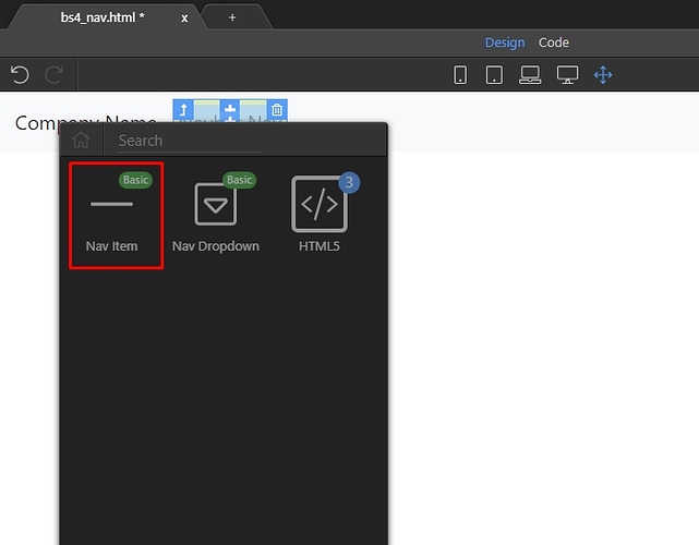
And then inside the Navbar Nav you can nest your links. You can do this in design view:
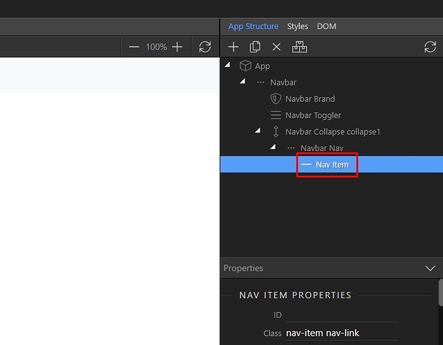
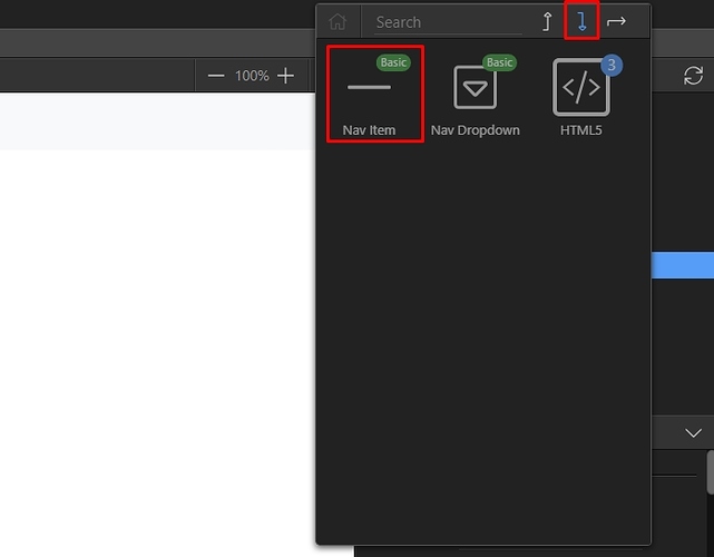
You can add more links in the App Structure tree as well:
Just click a link, select insert after and add a new link:
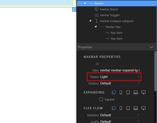
Style your Navbar by setting up the theme:
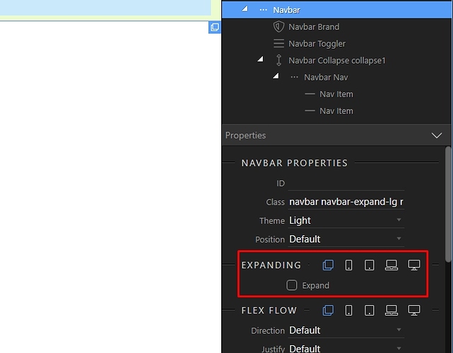
Choose on which device size the navbar should be expanded. Just click on the device icon, and check the expand checkbox. NOTE: If you want to have the menu collapsed on all screens i.e. to see the “hamburger” icon on all screens, just remove the expanded option for all the screen sizes.
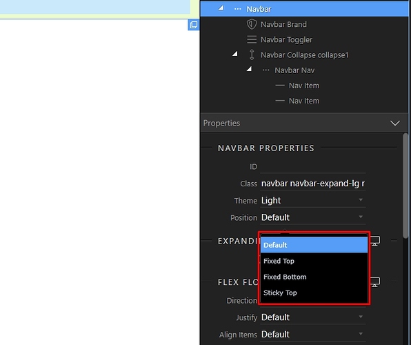
Select the Navbar position - choose from default, fixed top, fixed bottom or sticky top:
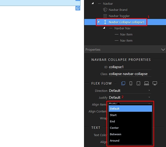
You can align the links in the Navbar, by selecting the Navbar Collapse element (1) and then adjusting the Justify property (2), so this allows you to align them left, right or center:
Last updated:
