Hello Wapplerfriends and @wappler_ambassadors I’m inviting you to share ideas how the process for designing wappler bootstrap layouts could be improved.
I’ve found some interesting ways and want to share what I like of these websites:
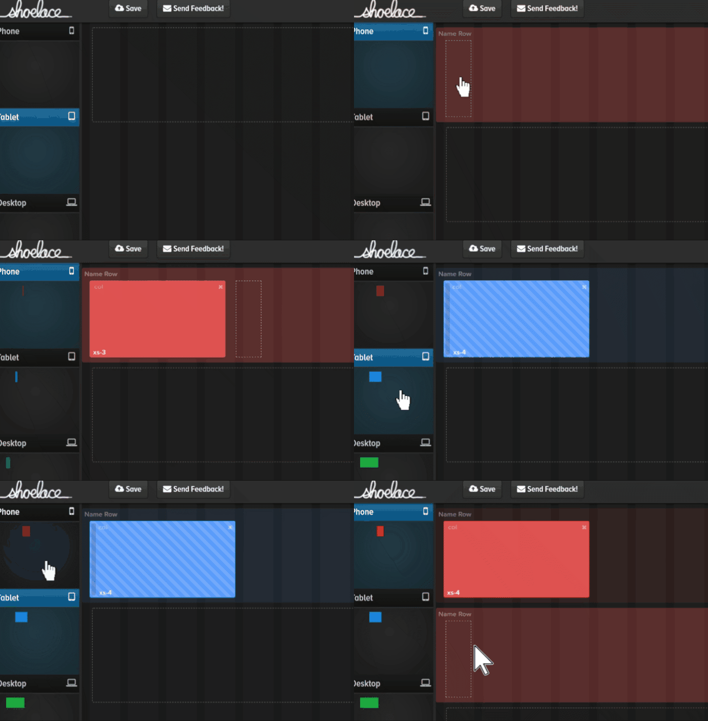
Shoelace
There is an interesting concept how the 12-columns will be handled. Its snapping and shows in a funny way how the layouts are shown on different screens.
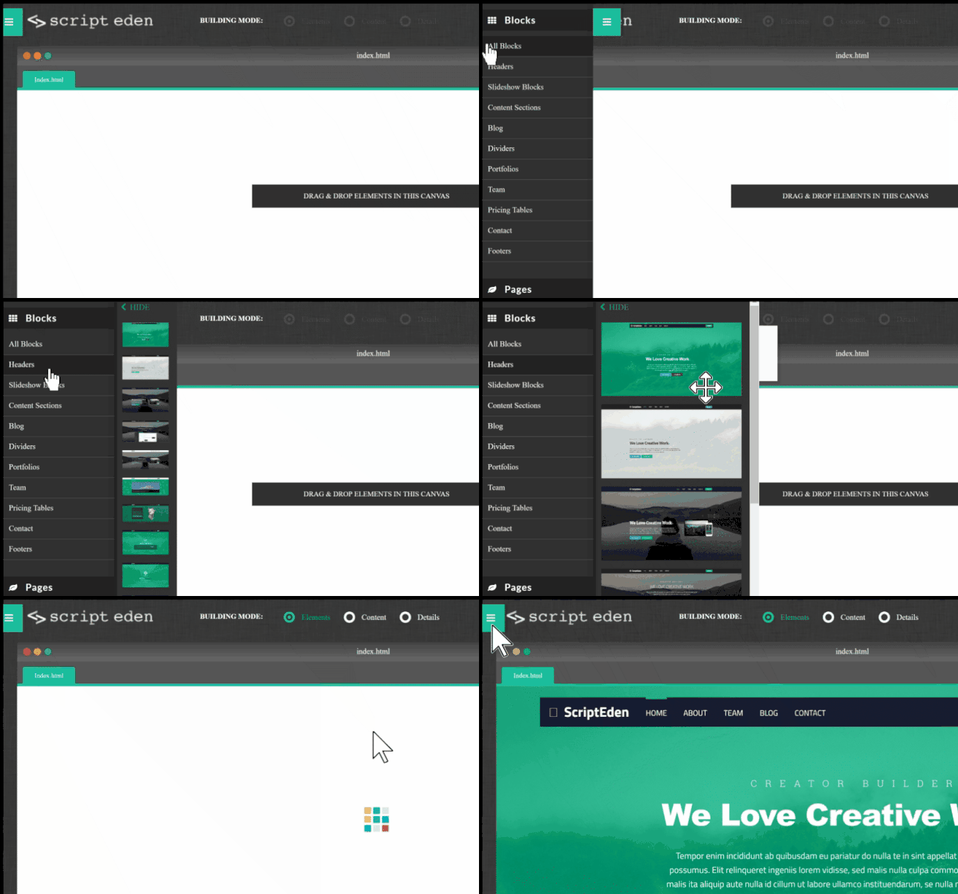
Scripteden
You will find alot of pre ready components which you can change to your own needs.
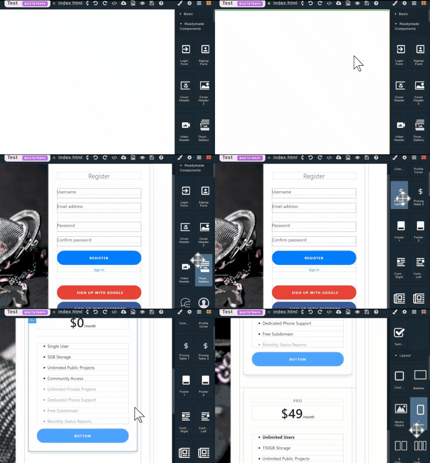
Gridbox
FREE : You can design your template with premade components like pricing table, tables, signup, login forms, video headers, testimonials, portfolio or gallery and many more.
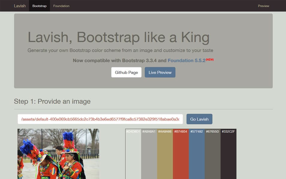
FREE, Advanced, not online: Lavish
Create Bootstrap Theme from Picture
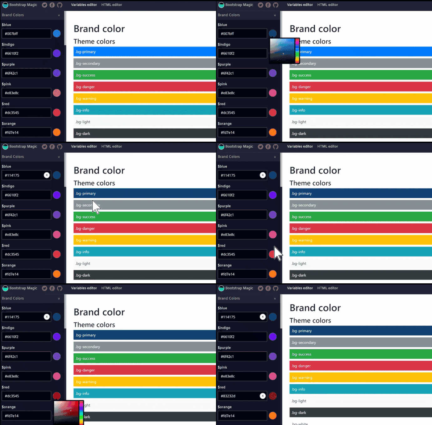
Bootstrap Magic
Quickly customize your Bootstrap theme
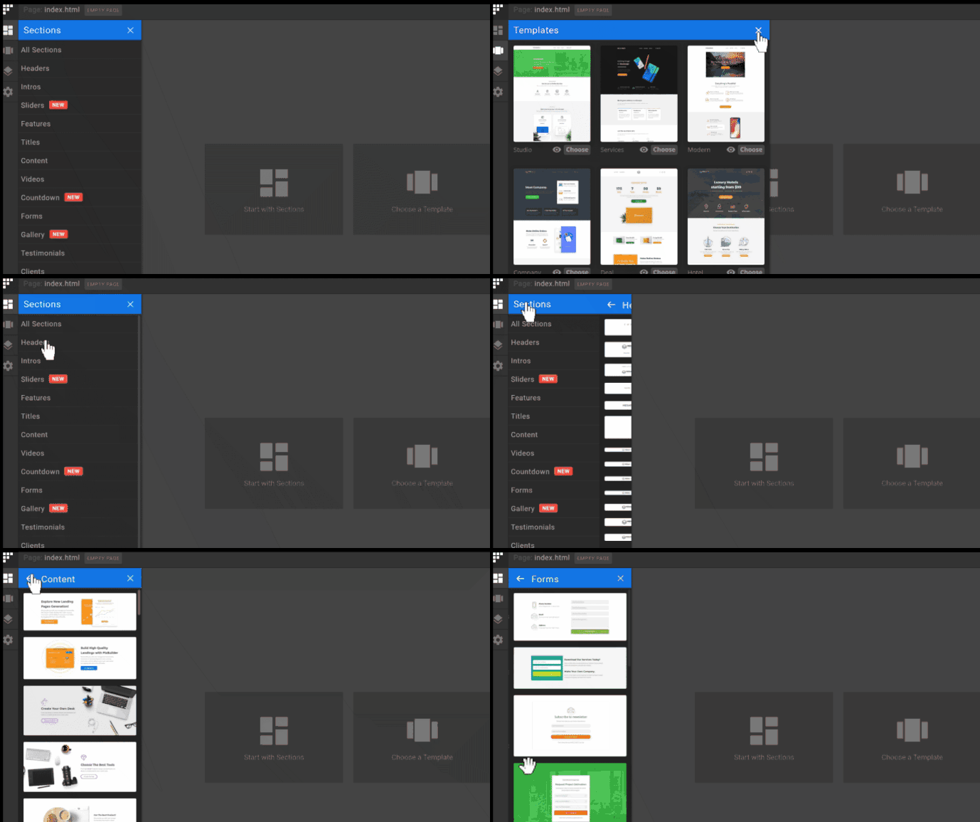
Pixfort Demo
Quickly start with Template or custom Sections and choose your elements. Very nice and fast to work
https://pixfort.com/demo
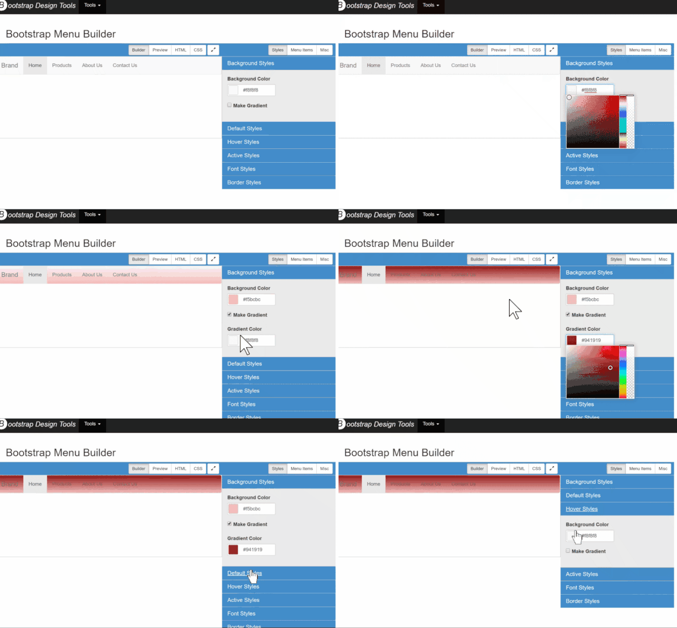
Bootstrap Design Tools for specific elements
- Menu’s
- Carousels
- Buttons
- Breadcrumbs
- Progress Bars
http://bootstrapdesigntools.com/tools/bootstrap-menu-builder/
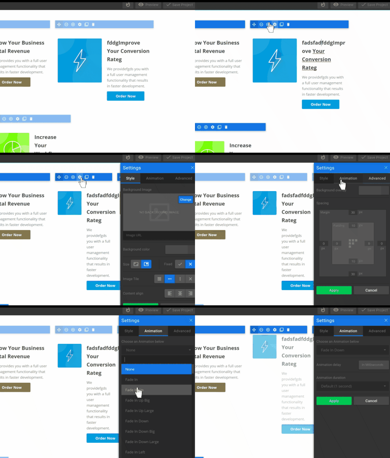
Its my favourite and changing an element can be done inline, which shows the propperties of it, like APP Connect on right side. Changing column width can be done with + and - which is quite good!
Wappler is great no question! But maybe not a bad idea to hunt for the next best feature and idea! I’m not sure what would be a good way to improve the design aspects from Wappler. But maybe you have an idea!
Additional helpful FREE / Opensource resources:
Froala
https://www.froala.com/design-blocks (Github Sources, Free Bootstrap Elements like 
- Call to action
- Contacts Contents
- Features
- Footers
- Forms
- Headers
- Pricings
- Teams
- Testimonials
GetFuelux Formbuilder
http://getfuelux.com/formbuilder.html
Useful for Drag&Drop Form Builder
Last updated:
