I would love to know, regarding website navigation, when you have a large batch of navigation on a website, and requirements to use things like mega menus, how others are managing this from a design perspective on Mobile as well as desktop viewport sizes.
This is a website navigation I use for one of my sites I would like to change.
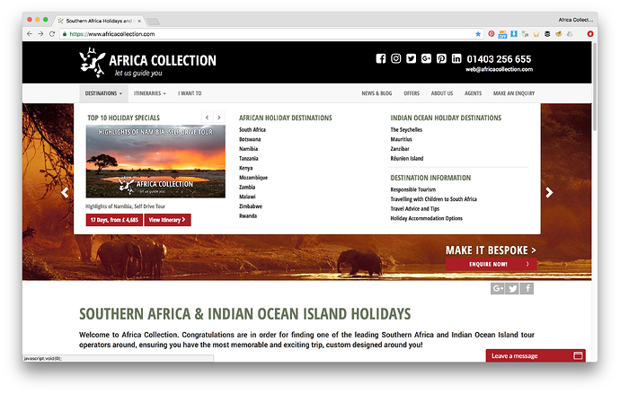
Desktop View of the navigation with a hover over effect on the Destinations DropDown
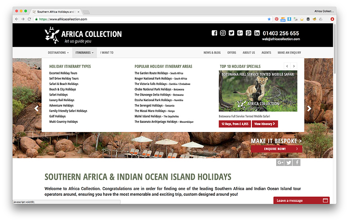
Desktop View of the navigation with a hover over effect on the Itineraries DropDown
Being in desktop view I have allowed the navigation to have a delay set on the hover over for about a second so it does not flick in and out while the user is just mousing past the dropdown, I have also allowed my navigation to be quite close together as well as my social media icons and clickable telephone and email address as I am not concerned about Touch Zones and Thumb Zones, which i will get to more on the mobile side.
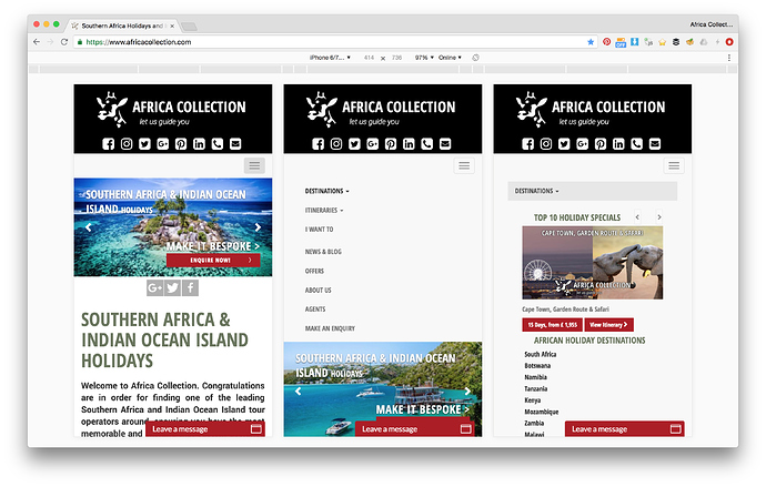
Mobile View of the navigation with a tap target on the burger menu
On the left image I have dropped the navigation to under the top black strip to try and be out of the primary “Thumb Zone” area so the user does not mistakenly push the burger menu while keeping it close enough at the same time that in the thumb stretch zone they can still tap it if needs be.
On the centre image I have tried to keep the “Tap Targets” as spaced apart as possible while still looking decent and pushing the page content down to accommodate however the rest of the site content as well as the social icons at the top do not adhere to the 57px index finger max width. The social icons are just outside the thumb zone though so I do not need the 72px wide thumb size.
On the right hand image there is just so much information there that I have not even attempted to worry about Tap Targets at all.
Basically what I would like to know is firstly, if anyone else here even bothers with all this rubbish, catering for the size of average human fingers and thumbs and if they are left handed or right handed or have long thumbs etc.
And secondly if you do concern yourself with these things, then what do you do when faced with a situation like this and have so much navigation to show on a mobile device that it starts getting out of hand.
Really just very interested if there are many of us fighting these same battles.
Last updated:


