We will guide you trough the main UI components of Wappler. Wappler’s UI is minimal, intuitive and easy to use. It consists of several main panels, needed in your workflow. The panels can be opened and closed by clicking on their icons in the toolbars.
Left Side
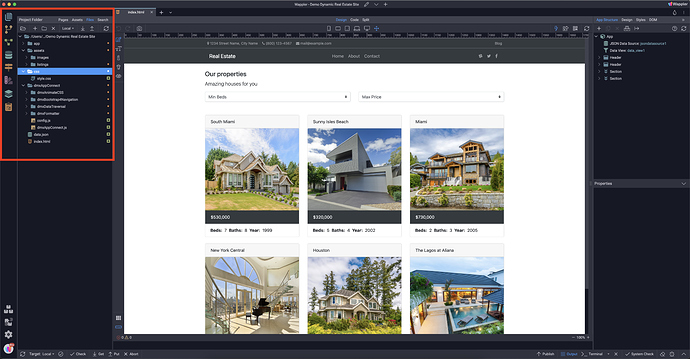
Site Manager
The Site Manager tool is located in the left toolbar. It allows you to manage your pages, site assets and local and remote files and folders.
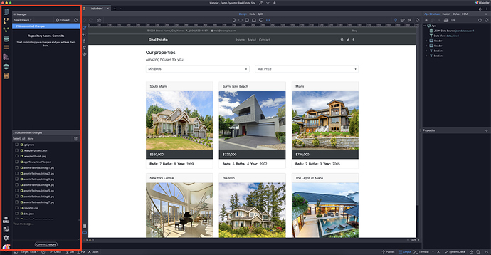
Git (Version Control)
The Git panel provides version control options in Wappler. You can create a Git repository for every Wappler project you wish to keep track on. Having a repository is great way to have a good backup of all your project files and their changes
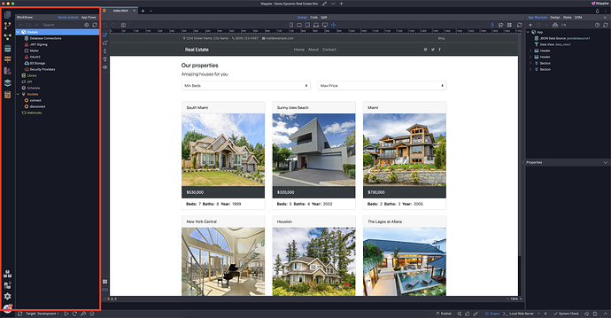
Workflows
The Workflows Panel is where you define your server actions and app flows visually. Connect to your databases, work with dynamic data, send emails, manage files and folders, process images, create login systems and more.
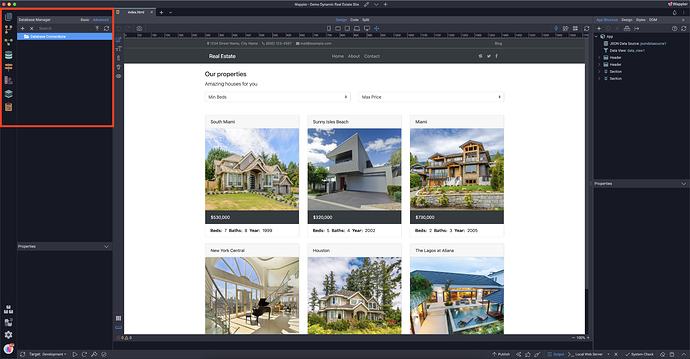
Database Manager
In the Database Manager you have a great visual overview of all your database tables, history of your changes, and database seeds. You can create new tables and fields or edit the data in your database.
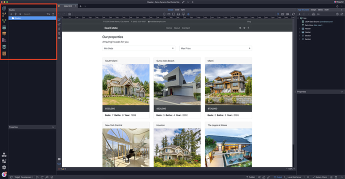
Routes
The Routes Panel allows you to create SEO friendly URLs for your websites, using the visual URL Rewriting options.
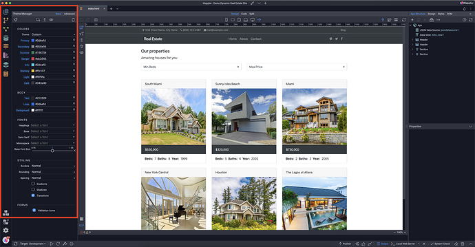
Theme Manager
The Theme Manager allows you to build custom styles by selecting different colors, Google fonts, styling options, and more.
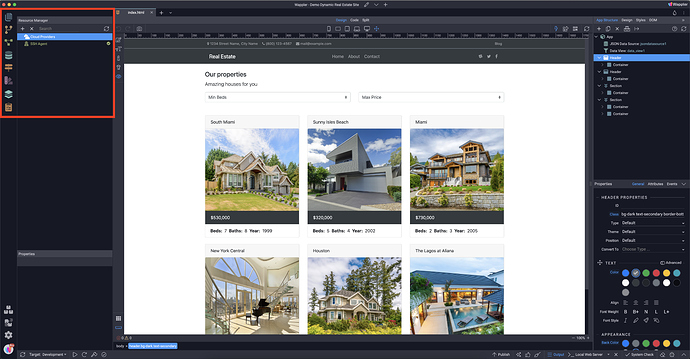
Resource Manager
The Resource Manager lets you organize all your project related resource in a single place, from cloud servers, database servers, storage solutions to local services.
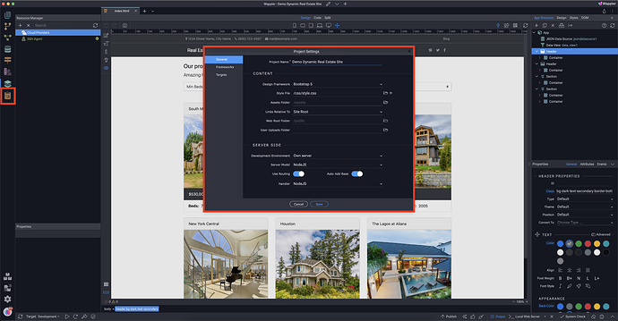
Project Settings
The Project Settings allows you to change all the settings for your project, like the framework, assets folder, server model and much more.
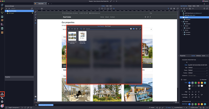
Project Manager
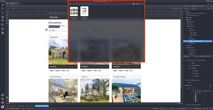
You can see your current project name, edit the current project options, load a different project, or create a new one.
The project manager also supports importing Dreamweaver site definitions (.ste files)
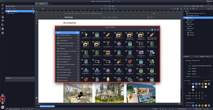
Extentions
In the Extensions panel you will find all the components included with Wappler.
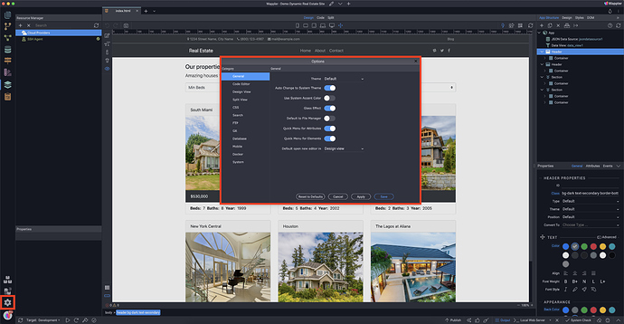
Options
These are the general options for Wappler. Here you can customize different settings such as - Code Editor, Design View, FTP, System and more.
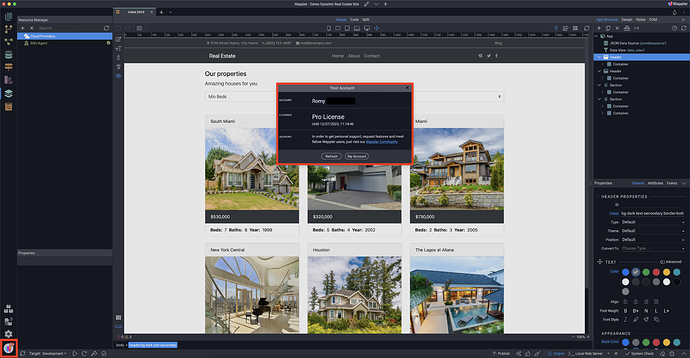
Your profile
Here you will find your profile information like your name, your licence and button to go to your online profile.
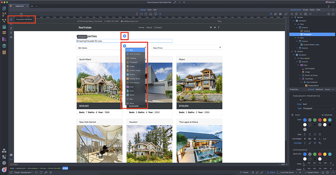
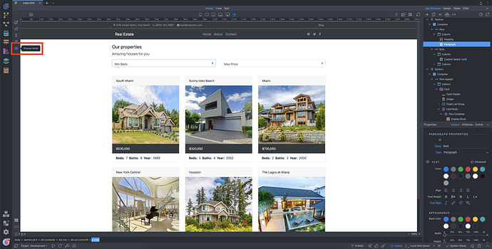
Component Edit Mode
When in component edit mode you can add different components on the page using the add component buttons, located before/after the element which you select.
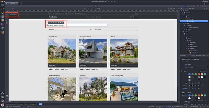
Text Edit Mode
While in text edit mode, you can change any text on the page with a single click. You can also apply styling to it.
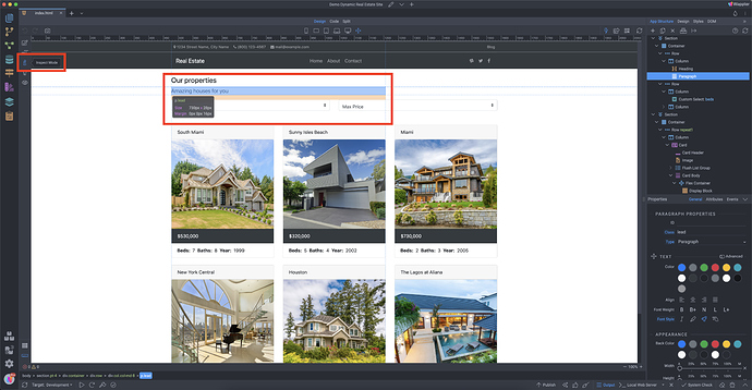
Inspect Mode
The inspect mode provides useful information about the styles of an element such as size, margin, padding. You can also measure distances, relative to the selected element.
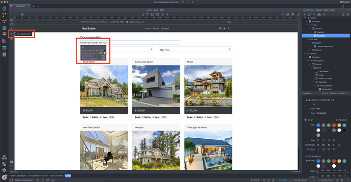
Accessibility Mode
In accessibility mode you can check the accessibility attributes and compliance status of an element. Along with the foreground and background color, you can see the contrast ratio and the WCAG Compliance status.
The color contrast between background and foreground content (that is, usually text) should be great enough to ensure legibility. Learn more here: https://www.w3.org/TR/WCAG21/#dfn-contrast-ratio
Web Content Accessibility Guidelines (WCAG) are a recommendation published by the Web Accessibility Initiative group at the W3C. They outline a set of guidelines for making content accessible primarily for people with disabilities but also for limited-resource devices such as mobile phones.
There are three levels of conformance:
Level A is the minimum level.
Level AA includes all Level A and AA requirements.
Level AAA includes all Level A, AA, and AAA requirements.
Learn more here: https://www.w3.org/WAI/WCAG2AAA-Conformance
Preview mode
Preview mode allows you to preview and interact with your page(s) the same way as in your browser - you can see the dynamic data rendered, you can click on buttons and follow links. Content editing is not possible in this mode.
Right Side
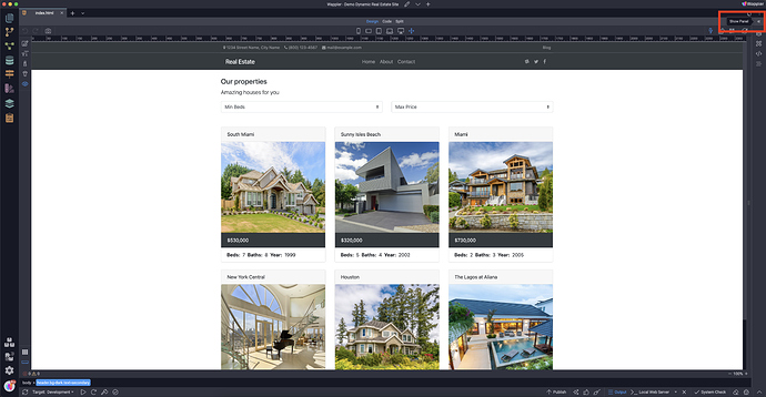
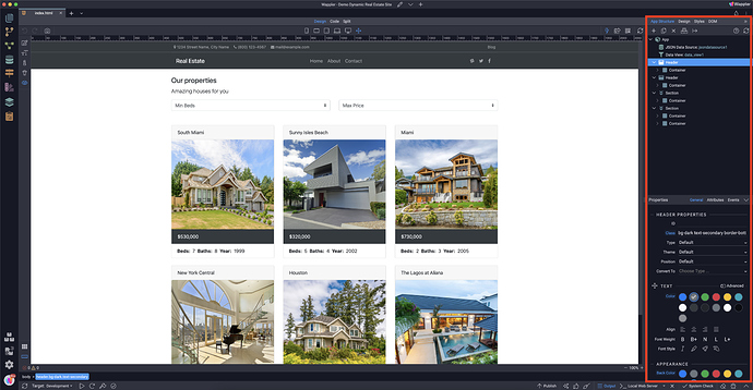
The panels located on the right side of the Wappler window are related to your page, design and front-end workflows. Expand the panel, by clicking the expand button.
App Structure
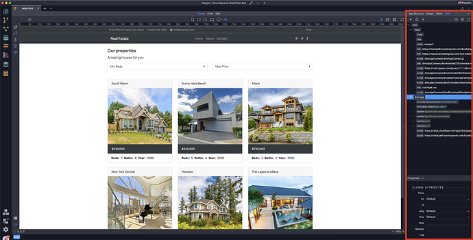
The App Structure Panel is one of the most important parts of Wappler and probably the most used one. This is where you design the web site/app structure and appearance. Add elements and components on the page, adjust their dedicated properties in the properties panel.
Design
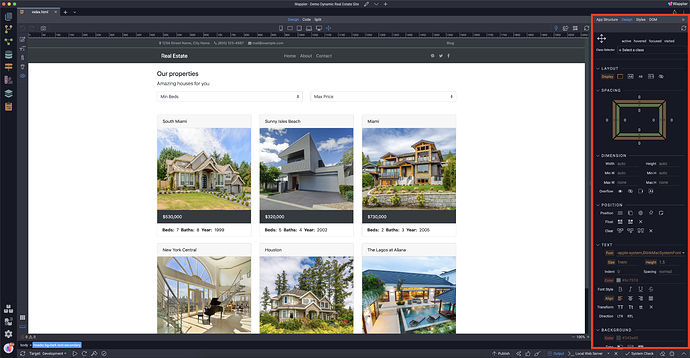
The design panel provides you with visual tools to style your page content. Here you can adjust the layout, position, text, background, colours, borders and many other CSS properties for any element on the page. You can design for different screen sizes, which creates the required styles and media queries for the selected device.
Styles
The styles panel allows you to write your own custom CSS rules, if you ever feel the need to write your own CSS by hand.
DOM
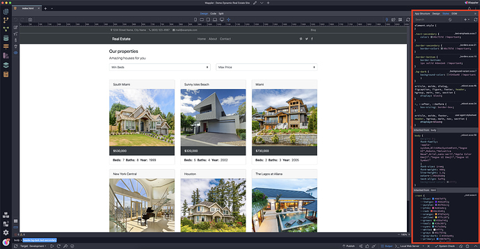
Unlike the App Structure Panel, which shows you only the components and properties of the frameworks you are using on your page, the DOM Panel gives access to all common HTML elements and their properties or attributes. This is where you will find properties that were not available in the App Structure panel.
Theme Options
Click on the drop-icon to change your Wappler theme. We offer many options including themes from older Wappler versions and light- and darkmode.
Bottom
Publish and Terminal
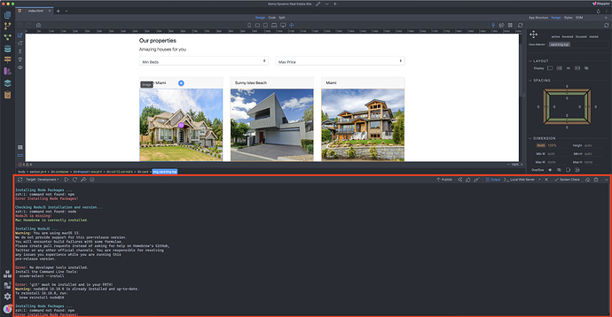
Here you will find the publish panel and the terminal. You can define your project settings, acces Node packages, targets and publish or sync your site/app to the selected target.
Top
The top toolbar of Wappler offers you different options related to your project, design and site/app preview.
Project Manager
You can see your current project name, edit the current project options, load a different project, or create a new one. The project manager also supports importing Dreamweaver site definitions (.ste files).
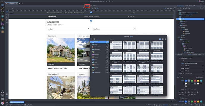
Design view
Probably the most important part of Wappler’s interface, where you see your design fully rendered. Here you can see how your website or app looks, you can visually add elements (inside, before or after) the selected element, duplicate whole blocks of content or delete anything from the page or app layout, and so much more.
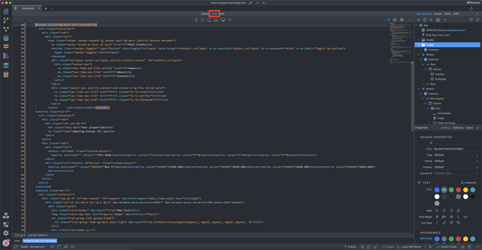
Code view
Wappler generates clean semantic HTML, CSS and JS code, which you can modify directly in Code View, if you feel comfortable to do so.
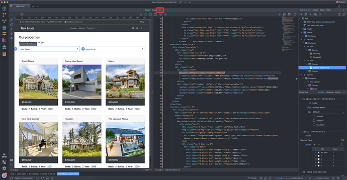
Split view
Split View offers a mix of Design and Code views. You can edit the code and see the changes directly in the design part, or vice-versa.
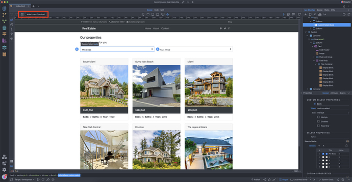
Make project thumbnail
This option takes a “screenshot” of your project and will use it as a project thumbnail, the thumbnails you see at the Project Manager
Responsive options
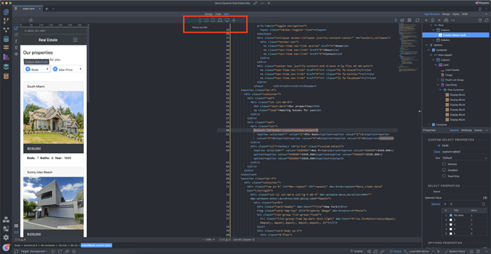
You can preview how your site or app looks on different devices, using the responsive options in the top toolbar.
Options top right
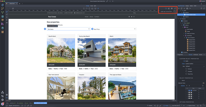
On the top right you will find the following options from left to right:
Toggle App Connect mode
App Connect is a high performance front-end framework just as powerful as React, Angular and VueJS. App Connect however is much easier to use due to it’s custom component structure and HTML5 attribute bindings. This toggle will turn on or off the live view of it.
Open in Browser
Opens your project in a browser. This way you can check your website live.
Show QR Code for preview
With this tool you can scan a QR code of your project to check it on another device.
Reload Design view
An hard refresh for your design view.
Last updated:
