Hello Team Wappler,
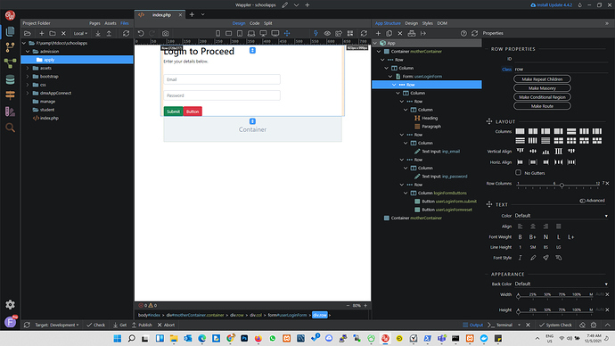
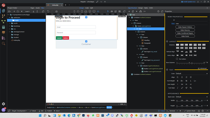
Sometimes I have a hard time locating some icons when I expand the App Panel to move the properties panel to the side of the app panel instead of beneath it. I suspect it is because the icons and property section headers like TEXT INPUT PROPERTIES, SPACING properties etc, all use the same colour without a very clear boundary.
I am suggesting a subtle but different colour border/boundary between the various property sections to help some of us quickly move around. Maybe an extra theme with these borders. Picture one is the default interface and picture two is the suggestion. Just as an example, Photoshop has something similar between all its panels.
Community Page
Last updated:
Last updated:

