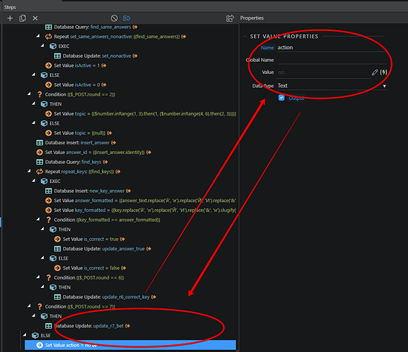
On the big monitors there is an inconvenience when you edit the last steps of the big SA. Because you’re looking at the bottom of the screen but properties are at the top of the screen.
I see two possible ways to solve this.
A. Add empty space under all SA steps that allows you to scroll down even if there is nothing.
B. Dynamically adapt the position of the Properties panel, so it will be next to the selected step.
I think the first option is better. Because it is more comfortable when you can always keep your working area at the top part of the screen.
Community Page
Last updated:
Last updated:
