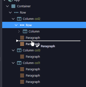
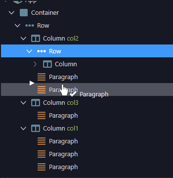
Imagine you have grabbed and dragged a node and want to drop it between 2 other nodes.
Expected UI here is that you see a thick horizontal line between these 2 nodes.

But currently you not only don’t see that line, but also the background of the one of a node is always highlighted. Which is expected when you drop in the node, but not between.

This issue is related to all places in Wappler where hierarchical trees are in use.
Community Page
Last updated:
Last updated: