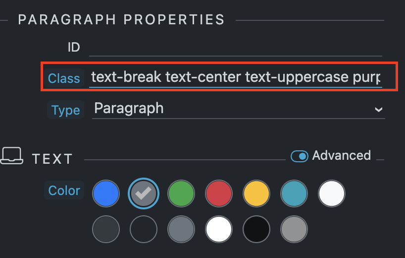
Most of the time when I have to add some classes by hand, the number of classes that an element has does not fit in the text input that shows the Wappler interface and I have to switch to the code view. This is annoying more than anything when I use the notebook since I have less space and I end up using only the code view. I propose that in properties, general of an element, instead of a text input it be a text area and in this way to be able to see and edit all the classes in a more comfortable and fast way.
By the way, I know that I can go with the mouse or with the cursor to the right, but it is really uncomfortable and not very intuitive to use it that way, besides that with the mouse many times I go past the class that I want to edit and I have to go back.
I show some screenshots to better visualize the proposal:
Grabación de pantalla 2023-02-13 a la(s) 23.13.27
Last updated:
