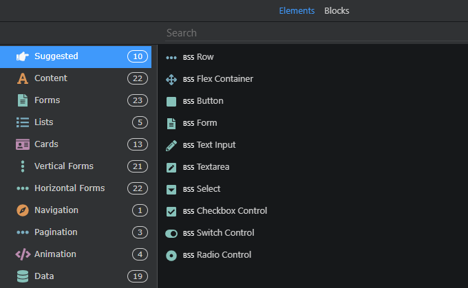
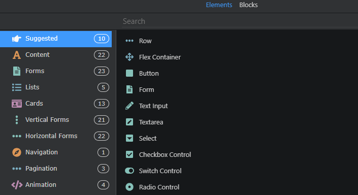
In the “new element” window I prefer using list view, because it is more compact, therefore it is easier to go through elements.
But the BS5, AC, FA tags look the same as titles, so they interrupt the reading and make visual search harder.
I have a couple suggestions on how to solve this.
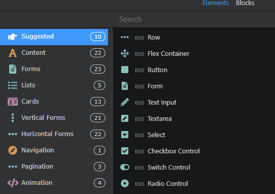
Most simple and still effective way is to make these tags grey.
We could even place it after the title.
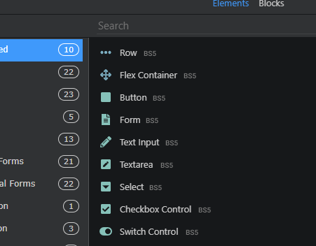
But it is still styled as text so we can make it look like actual tags.
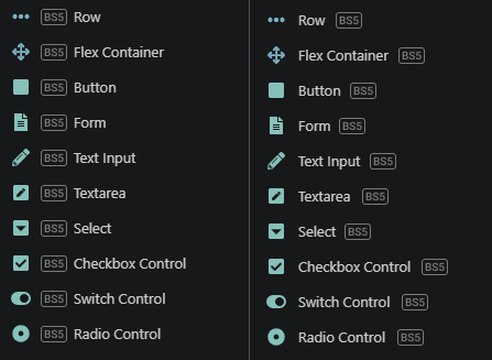
But all these versions still have clunkiness and noise.
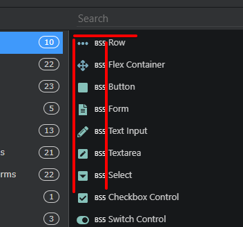
So, maybe we can even delete these tags? At least here, in list view.
Now it looks clean and easy to read.
Or maybe it is a bad idea because someone finds these tags helpful? Idk, let’s discuss it.
PS: Also, I think it is worth adding more space around the icons and before the titles.
And titles seem to high regarding icons (1-2 px)
Link to Figma files.
Last updated: