I have some ideas how we can improve the current Properties panel for page elements.
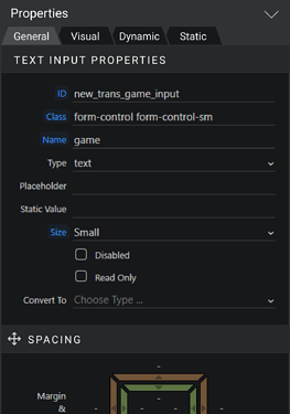
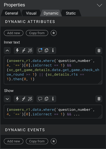
1. If you prefer when the Properties panel takes only half of the monitor height, then you know the struggle of necessity to often scroll down to the bottom of the panel and to the top again.
To resolve this I propose to place tabs on the top of the panel. These tabs quickly scroll you to the corresponding part of the panel.
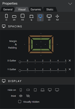
2. Current titles for Sections not doing a good job in visually separating the sections.
So as you see on all the screenshots, I’ve added background color for them.
3. If the “Visual” tab is selected, you can see the buttons for quickly changing layout width. This panel with buttons stuck to the top. It is a good addition to the current buttons on the top center of the Wappler UI.
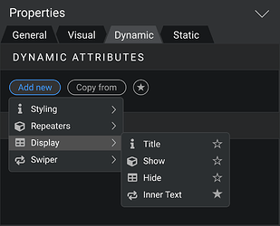
4. Button for adding new dynamic attributes or events is not very comfortable. It is tiny and placed at the edge of the screen – so it is hard to get to it.
So I propose to move it to the left and label it “Add new” to make it bigger.
5. I think it is better to get rid of the big popup windows for choosing the options, where it is possible. For example, when adding new dynamic attribute. These pop ups change visual context, so you lose the focus. There are already good alternative for it - simple select blocks.
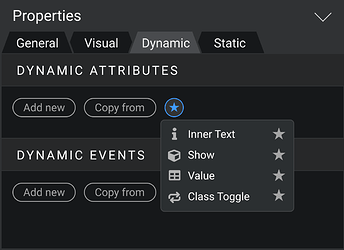
6. Sometimes you just want to copy all the attributes or events from another element. Now there is a button for it.
7. For an even quicker process of adding new attributes you have a Favorites button.
8. I keep promoting the idea that the ability to instant edit the code of expressions would incredibly speed up work in Wappler for most of the users. I see support for these idea in the community and still don’t see any defenders for “expression bubbles”.
9. Overall, all changes require a button panel above the textarea.
First button is arrow. I assume, when you open panel, textarea would be 2 rows, but if you click the arrow button, textarea changes the height to show all the code.
Also, from the right side there is a trash button for deletion.
Let go through all other buttons in the panel.
10. “Lightning” button opens the binding panel. But there is a difference - this panel doesn’t have a code textarea itself. When you choose some item for binding, it appears right in the textarea in Properties panel.
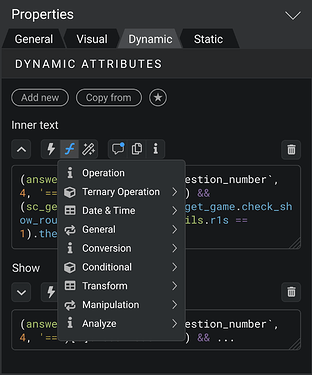
11. “Formula” button allows you to see all formatters and add it in the textarea input.
12. “Magic wand” button is for the Data Formats window, for creating expressions visually.
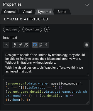
13. “Commentary” button shows and hides another textarea input, where you can leave a comment about this dynamic attribute you compose. I think the ability to document all the parts of the project is crucial for comfortable work in Wappler.
I purposely have changed the icon from “i” to this, because actually now “i” is used in Wappler for both commentary and info/description. I think it must be separated.
14. “Copy” button just copies all code of expression to the clipboard. So you could paste it anywhere else.
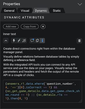
15. “Info” button provide the description of this attribute. It would be especially useful for new users.
So what do you guys think about this concept?
PS: As always, there are raw files in Figma available, so you can copy it and bring your own vision.
Last updated:
