Hi everyone!
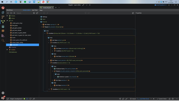
I’ve made a redesign concept for Workflow page. There it is:
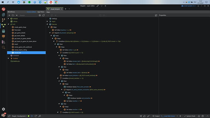
For instance, that how same workflow looks now.
I am struggling in reading and understanding it. Hard to see, what is going on.
In my version there is some changes:
- Every logical part of the workflow is visually separated from another by borders. So it looks like rectangles, or blocks. Now it easy to recognize them. Even more, there could be a color coding. For example, blue borders is “repeat” and orange is “conditional”.
- To the left of every step now is a number, that shows a index of this step inside this logical part of workflow.
- Deleted all white arrows. For me, they sometimes help, but most of the time just confuse.
- Deleted all “Steps” lines. I understand, that there is maybe some use of it, that I don’t come to still. But at the moment it just only make harder to read workflow.
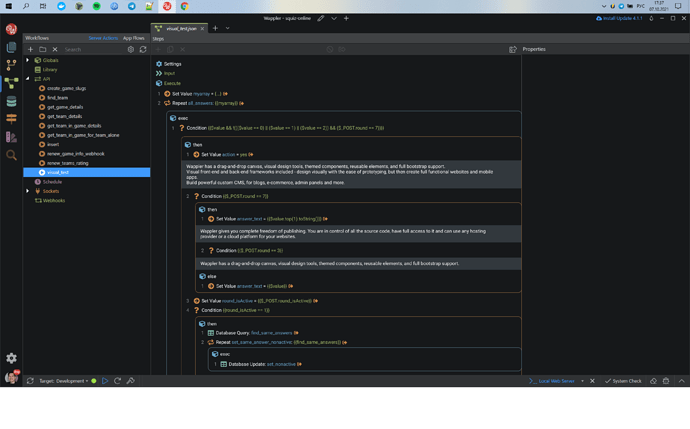
- I added comments in the way of collapsable area with flexible height.
At the moment I don’t figure out good way to visually show if step have some inside steps or commentary inside. There is some ideas, that shown on the other design layouts in Figma, but I am not sure about them.
I understand that my concept not ideal, and especially because I’m relatively new to the Wappler. So feel free to ask questions, make suggestions and give criticism if needed. Let’s find comprehensive solution together.
Also, all layouts available in Figma, so you can make a copy and bring some of your own ideas. https://www.figma.com/file/wDkeap79ii1n4AJjWYRroX/Wappler-Redesign-Server-Actions-Concept?node-id=0%3A1
Last updated:


