continuing discussion from Wappler 4 RFC: Editor Tabs for Server Connect actions
Thanks for promising changes done with SC - they will be of help to many.
Requests for better use of the massive space now made available in the SC tabs.
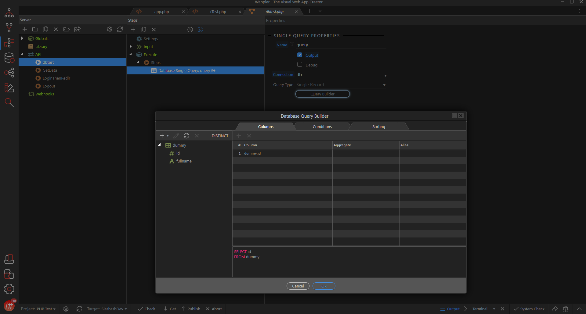
ONE (DB Actions)
we have so much space now. showing the DB actions of insert/update/delete/select on the tab itself is so much more better than having to open them in a modal. width of 400px-600px should be sufficient - will have to be fixed in px i suppose coz with % based width, handling wrapping will be difficult (my thinking process revolves around web - it maybe different for desktop apps - pls factor this to consider my feedback)
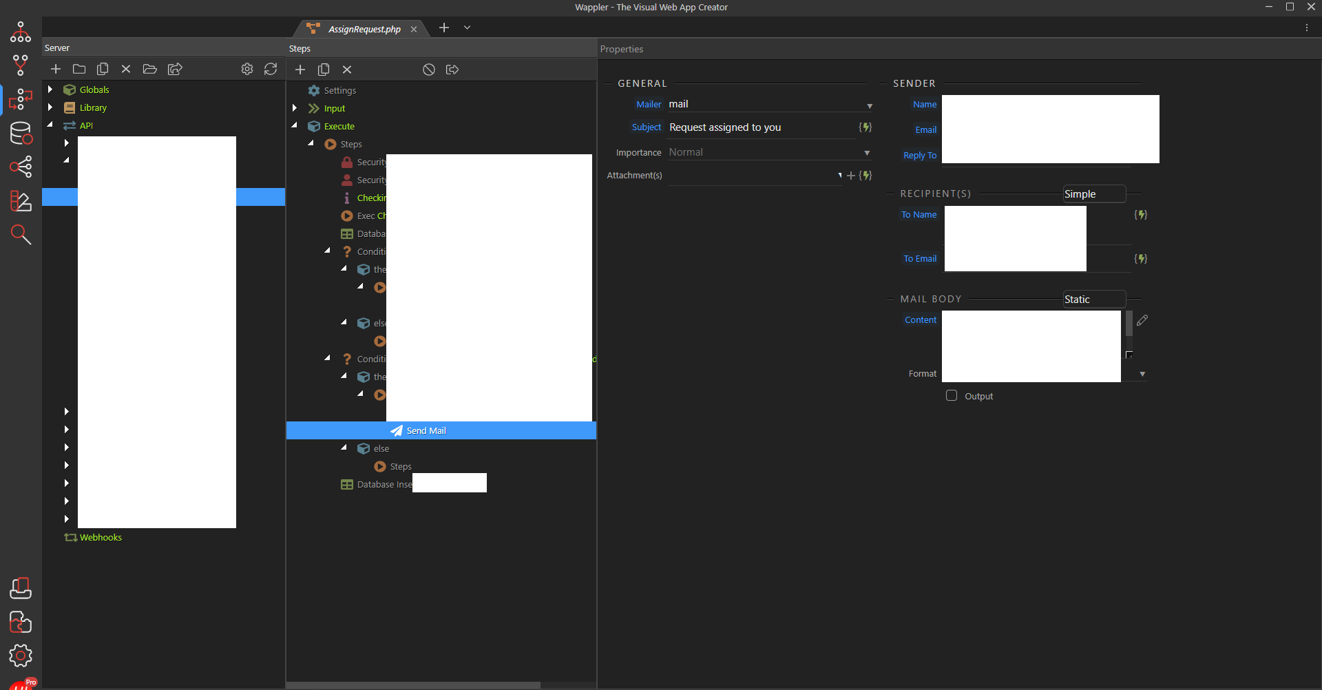
TWO (Send Mail)
the GENERAL part of the send mail action can be in a single row and wrapped to continue on second line depending on the width of the screen. the width can vary depending on content - maybe will have to keep it in multiple for 400 for more ‘linear’ visibility. most displays these days are 1920x1080p or higher.400px will give a comfortable space for 3 inputs in a single line i suppose.
the SENDER part can be stacked right below the GENERAL part and with a similar horizontal layout that wraps onto the second line with the mail body given a very nice full width for better use of space.
vertical scrolling on this 3rd pane should be widely acceptable.
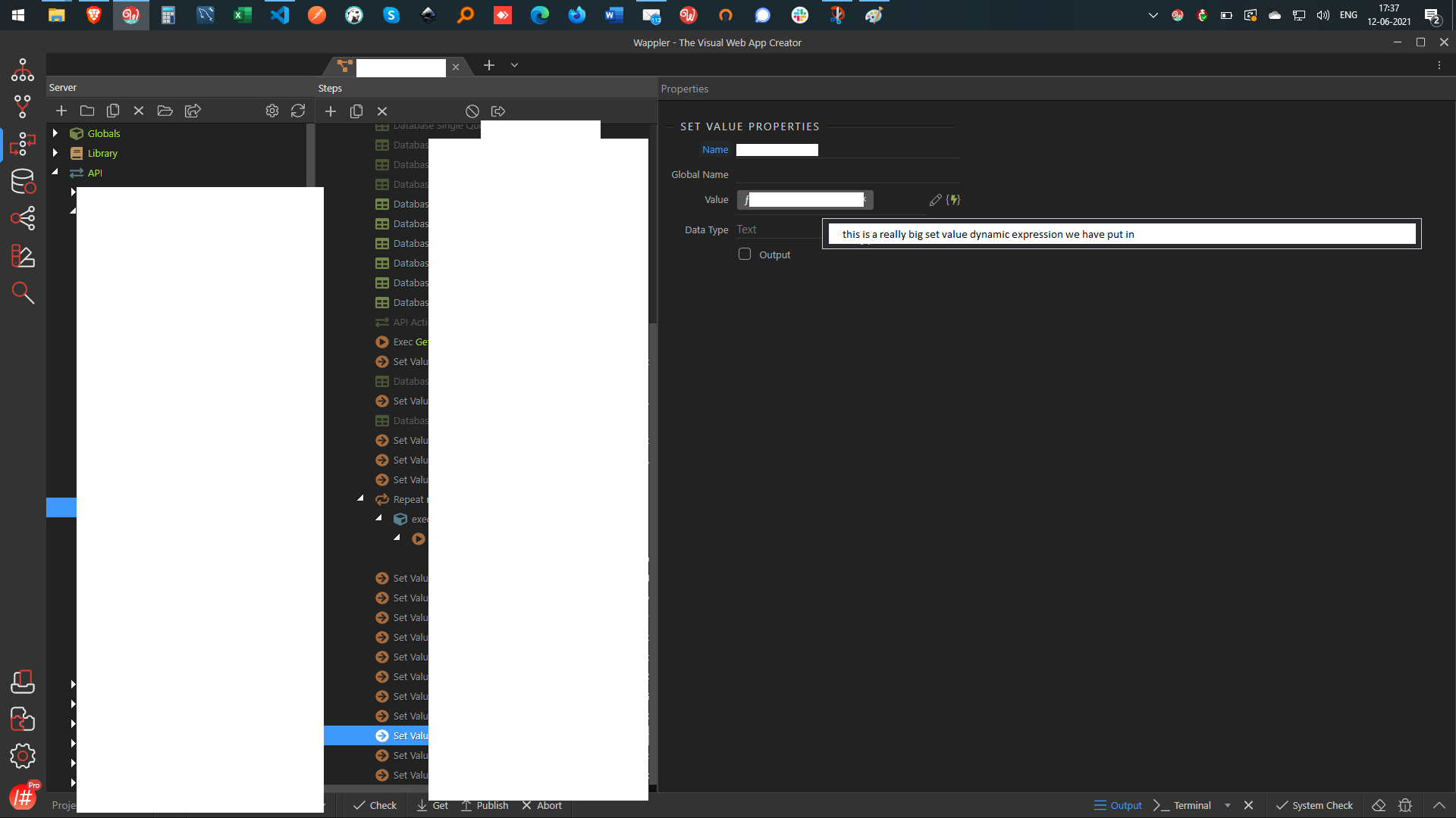
THREE (Set Value)
continuing on the previous idea itself, with a separate example coz stopping at 2 did not seem right.
we have a really big set value dynamic expression - if this were a full width box (while keeping the vertical layout for better use of space) then it becomes much easier to read.
for smaller expressions, having a big input box with a smaller colour blob isn’t too bad either.
(sorry for the all the redaction - these are from client projects - cannot expose anything)
IMO, 2 well done features are better than 5 mildly ok ones. Please consider prioritising quality over quantity.
Just a plain repositioning of SC in tabs is not good enough - using that space to allow for better experience is important too. I hope the more people agree with me on this than not! its better like this than having a tiny single pane - but if the team are taking so much efforts to improve things - go all the way - don’t leave us high and dry so much.
Please consider these requests. Thank you.
Last updated: