Wappler uses hierarchy nodes for composing the workflows and I like this approach.
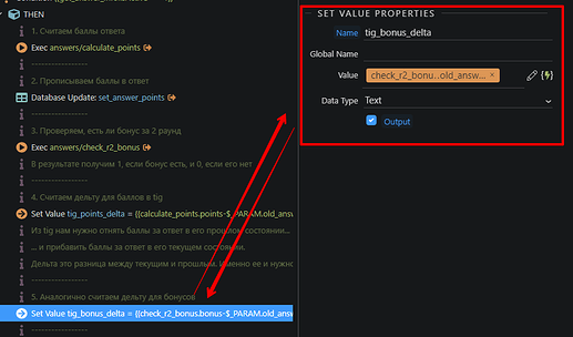
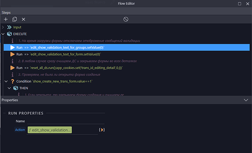
The one of the problems with it though is that the properties panel shows up in some distance from the node.
At the backend in Workflows the panel shows up to the right at the top.
And at the frontend in the Page Flow the panel is always visible at the bottom.
And this is a huge waste of time and focus. Because you click the node, then your eyes and your cursor take the trip to the properties panel, you make changes, and then go back. And it repeats constantly while you work.
Good solution for this would be to show properties under the selected node.
Considering there are not many inputs in the properties for most of the actions, it will fit ok.
Yes, there are some actions that have many settings in the properties panel, so they can be left with the current state.
I think this will make work in Wappler faster and more comfortable.
Last updated:


