I have seen that the Wappler team is working on a redesign of the graphical interface in many areas and it occurred to me to see that the front end part has not received some love for a long time, so I bring some ideas to the table that may be of interest.
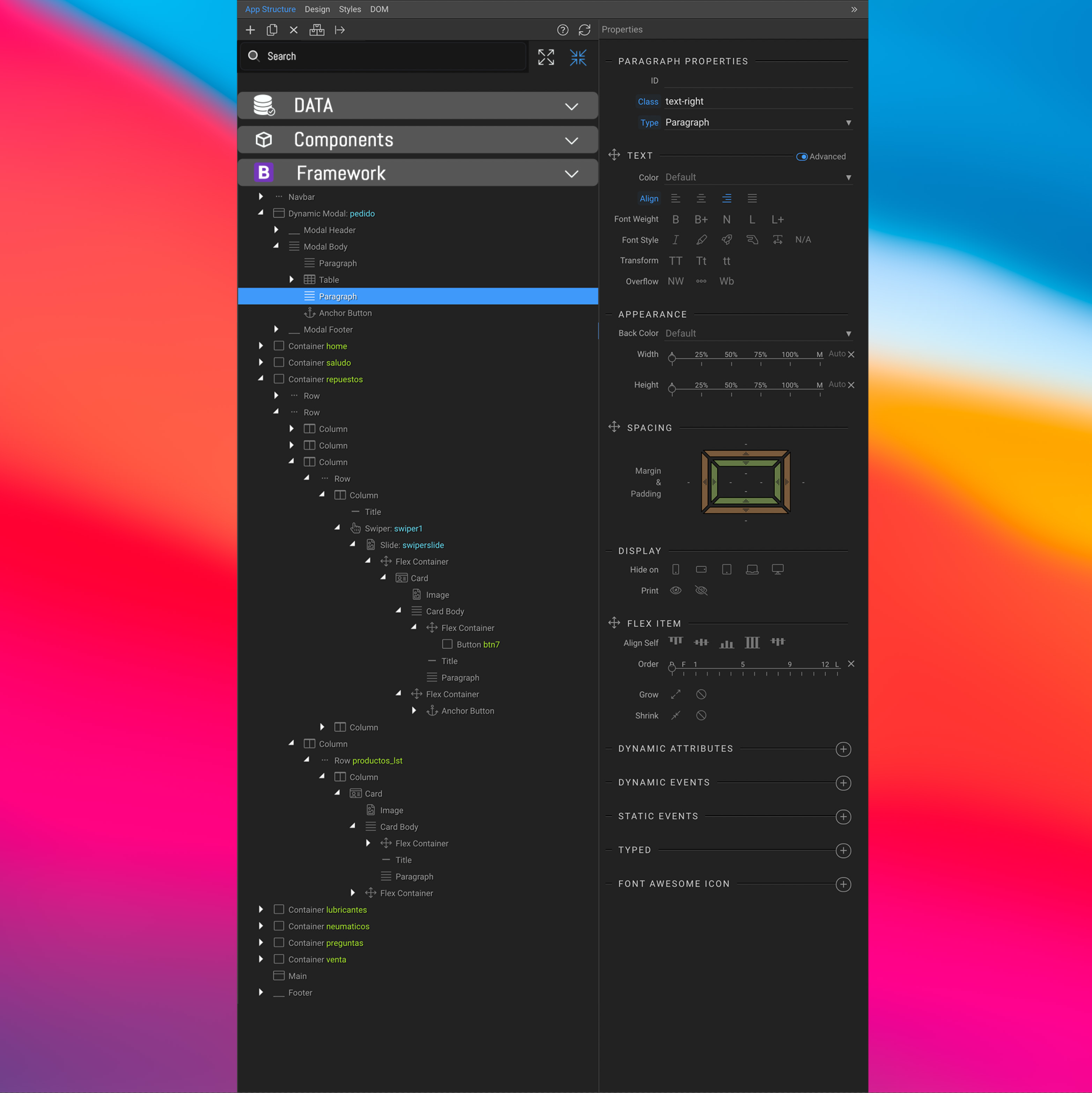
I don’t really have much time these days so sorry I didn’t use any professional tools to make the image, which I did in 15 minutes using an iPad, but I think it serves to represent the idea in general.
-
The first thing I thought was important to add was a search field, sometimes we have many columns, forms, etc. on our site and it becomes a bit tedious to search with the mouse or in the code view. Personally, I am working both in code and using the visual interface of Wappler depending on the time I have.
-
Perhaps the most profound change in my proposal is to separate what are items that correspond to data, components, framework and personally I would also add variables, in this way I think we can order better and when editing we can access more fast. At this moment I usually use sections to separate one from the other and put for example all the server connects together. Next to the search field I put two buttons that are used to expand or compress all branches and sub-branches.
-
Another change that I propose would be to color the icons as it was done with those of server connect, it may not be a very important change but I think it could help, for example, to find a table or a form more quickly.
Please feel free to constructively criticize this proposal and suggest other changes that you deem necessary. My idea is not to criticize the application but to help everyone to use Wappler in a better and efficient way.
Last updated: