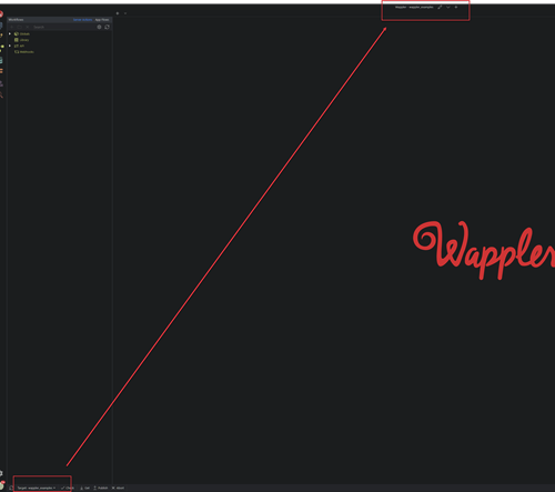
While v4 was in beta, I think it was mentioned that the Target list might be relocated - to the top of the Wappler window, next to the name of the current project. I think this would be a good idea, and a logical change.
Currently, it’s not very easy to see the list as it’s typically a busy part of the UI, so has filenames in the background. It’s typically obscured by the somewhat redundant ‘Active Target’. Here, I can’t easily click on ‘Remote Server’:

On the other hand, there is lots of unused space at the top of the monitor:
Before taking certain actions, particular if I’ve been switching between projects, I will often check two related and critical pieces of information:
- the project name
- the current target
Unfortunately, they’re about as far apart as they can be - which is quite far if you have a very large monitor:

Last updated:
