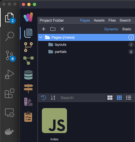
Wappler 5 added a new colorful icon above the folders icon. The problem with this is, it breaks muscle memory when clicking the folder button from people that regularly work with Visual Studio Code as well.
Please consider adding an option to put that icon in the lower end of the sidebar to enhance UX for those affected
Community Page
Last updated:
Last updated:
