Hi everyone!
Some time has passed since I started the topic “Redesign concept for Workflow page”.
It was quite a productive and inspiring discussion.
So now I want to share my current renewed vision about this matter and hear what you think.
Currently I see 4 main flaws in Workflows.
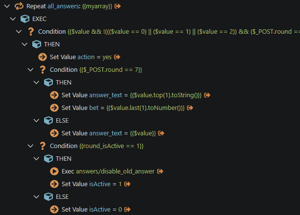
1. Nodes look messy, when hierarchy appears.
It is becoming hard to distinguish where one group of nodes ends and another begins. This is exactly the problem that motivated me to make the first redesign concept for workflows.
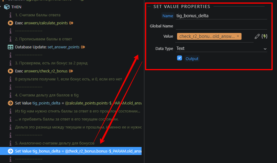
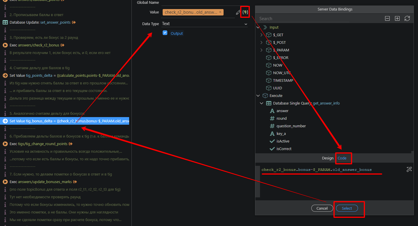
2. Commenting is a struggle.
I think that documenting your code is as important as writing code itself. At the moment it is hard to create a comment node, hard to make a long text from it, hard to distinguish it from regular nodes.
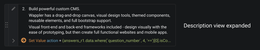
You can see here how much I need commenting and what kind of a approach I came up with.

As seen, I have one comment before every node, it has a number and a title. And some other comments go after node sometimes, it has detailed explanations.
3. Preferences panel appears in some distance from the node.
I find it inconvenient. Because it takes some time to cross the distance with your eyes and cursor.
4. Code editing is hiding far away.
It takes a long time and many clicks to reach it. But I use it all the time.
.
.
So now I wanna introduce Workflow Redesign Concept 2.0!
Here what I am suggesting for each of the issues respectively.
(full original layouts available in Figma here )
1. Better flow reading.
1.1. Every node now is a solid brick.
So when they are stacked, it is easier to understand the level of each one and see the complete tree overall.
1.2. Also, every node has a number.
It is unique only within the group (repeat, condition, etc.). It makes it easy to read the flow, to understand the order of the steps.
2. Every node has a text description.
It could be short or very long with a lot of paragraphs.
First line of the description always shows in the node. (so it handy to write short title in the first line)
So all nodes consist of two lines now.
On click the description expanded.
Details:
(1) Regular “only comment” nodes remain available for cases when you want to add a comment not connected to any of the steps.
(2) Maybe it is worth giving users an opportunity to hide all descriptions, so nodes become one-lined again. It would be useful if users don’t need to use comments within nodes.
(3) When editing node properties, first we see input for description in one line. Only when we click on it, it becomes a textarea with all text seen.
3. The properties panel is integrated in the tree and appears right after (under) the node.
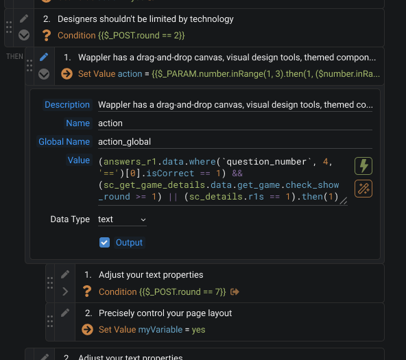
It allows editing properties fast and without changing the context.
I assume there are some actions that have a lot of properties, so for them it may be left as it is now, in the right panel.
4. Code editing available right from the properties panel.
So you can change the code right away.
And Data Binding window available by the click on the lightning icon, as before. But the window itself doesn’t have code editing anymore (as it shows in properties now).
When we click “add” in the Data Binding window, a selected object is added in our input.
And when we focus on code editing, the Data Binding window doesn’t disappear. It stays in the view until we close it.
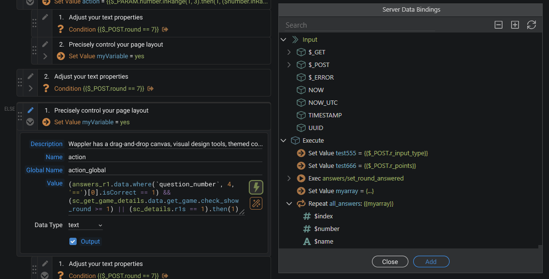
Also it would be awesome to make drag-n-drop from Data Binding to code input.
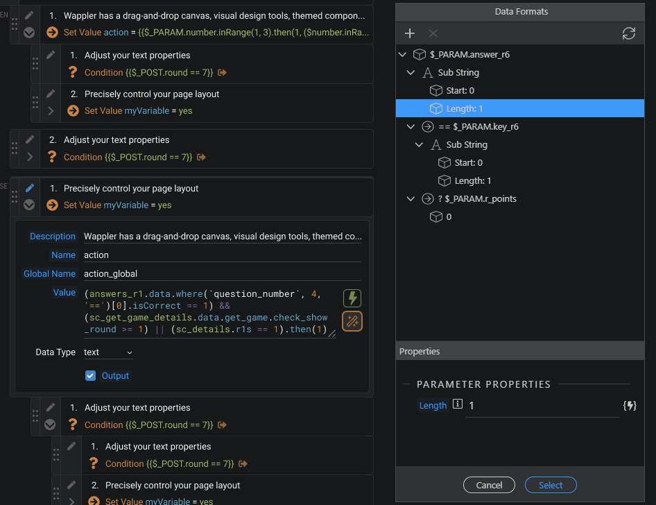
Of course, the visual editor of expressions (Data Formats window) is also available as before, by clicking the “magic wand” icon/button. But the icon itself is now in properties.
Overall, I think, this concept manages to solve main problems of workflows.
So work in Wappler would become faster and convenient.
Once again, full original layouts available in Figma here.
Waiting for your emotions, opinions, suggestions and questions!
Last updated: