Workflows Design - one of the things that bothers me in Wappler the most.
I have already suggested two different concepts for Workflows Redesign a while ago. (first, second)
Now I want to suggest one another concept.
Here how the problem looks like:
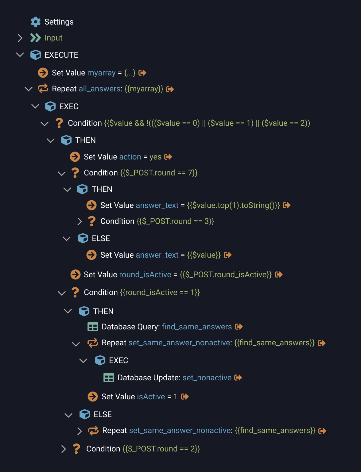
In this server action it is impossible to figure out what is going on.
Main problem, I think, is that it is hard to understand what level each node is placed.
Let me show you a simple example.
Here is a little hierarchy tree.
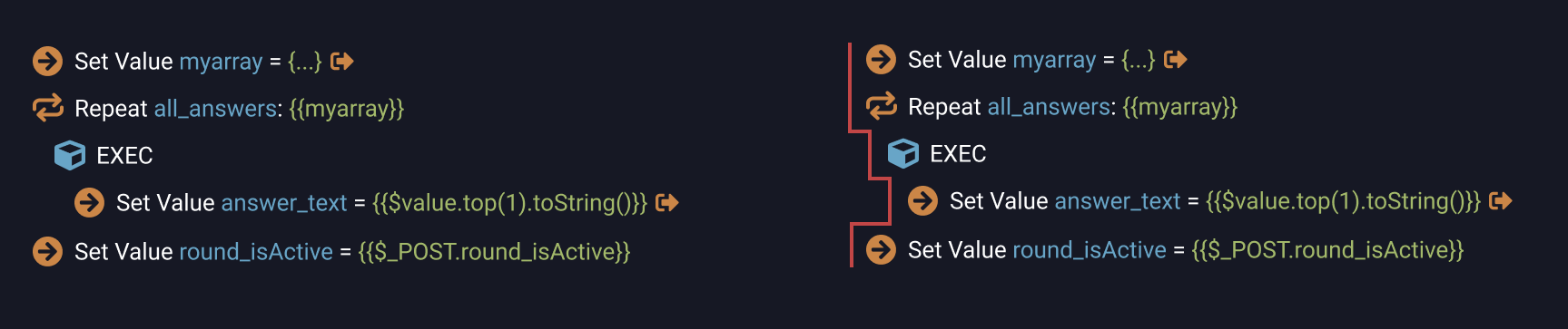
It Is easy to read the node levels: first, second, third. Because it is easy to see the imaginary border line (marked red), that visualizes the levels.
But let add some arrows:
And the mess slowly begins.
This is not the problem of how arrows are designed.
This is because with arrows it becomes hard to see the imaginary border line, that is needed for understanding the level each node is placed.
Every app that uses a similar hierarchy tree is faced with the same problem.
I haven’t seen a really good solution yet.
But I just came up with this idea.
What if we use a different background color under the arrow?
So the border line became clearly visible. And everything else stays intact, including the arrow.
I think it is quite an interesting solution.
But we can make it even better.
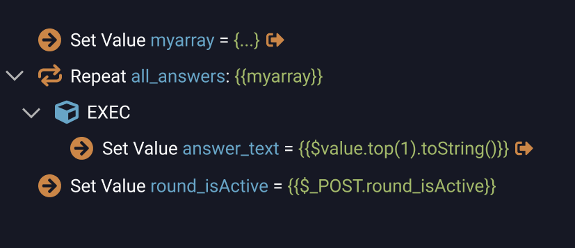
Because there is another problem: those secondary nodes with EXEC, THEN, ELSE. Problem is they have the same design as the main nodes. So they create additional visual chaos. But of course we can’t just get rid of them.
First thing that we can do with them is to darken the text and icon colors.
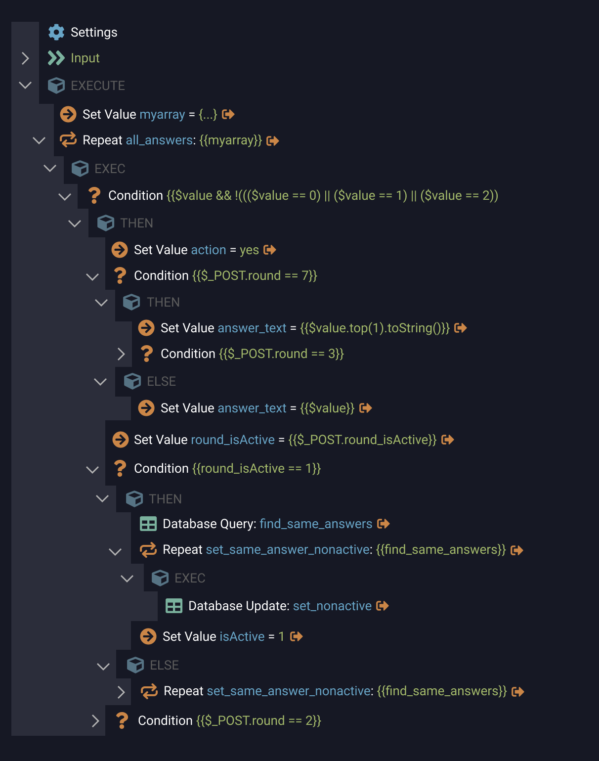
I think it made overall tree readability better. Because now it is seen that those nodes have different roles and meaning then main ones.
Next suggestion – to get rid of the arrows near these secondary nodes. I personally don’t use them. But maybe I’m mistaken here and somebody is using this to show/collapse EXEC, THEN and ELSE? Feedback appreciated.
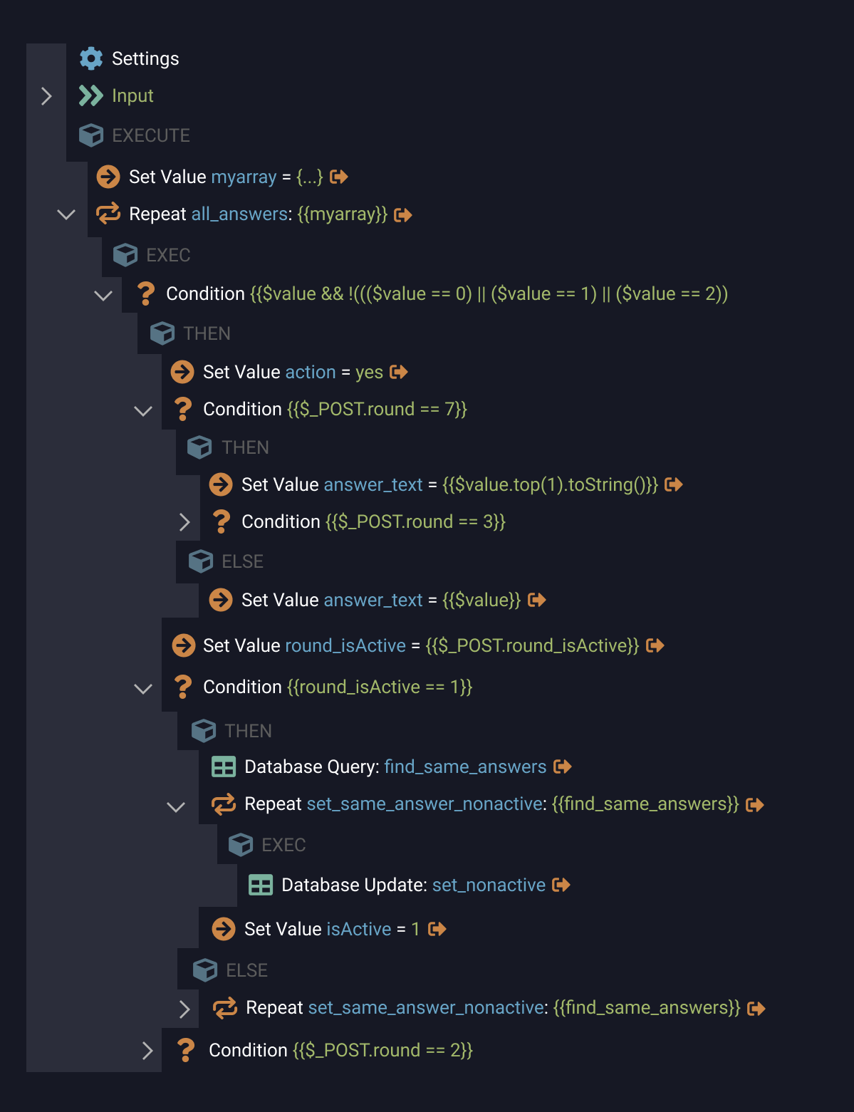
I think design has become even cleaner.
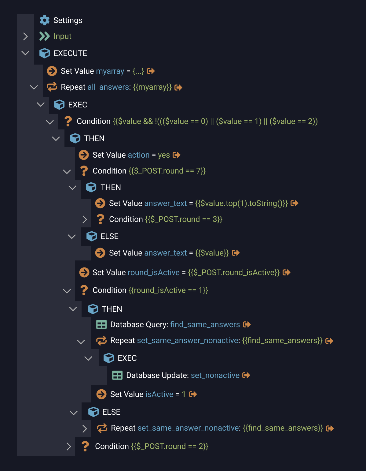
But the one problem left with these secondary nodes: They create additional hierarchy levels.
For example, you have a tree with 4 levels. But with these nodes it became 8 levels in the tree.
It makes it more difficult to understand overall tree structure.
So I suggest moving these secondary nodes to the level of child nodes.
And to make them easy to distinguish from steps, we must remove an icon.
Here the final result:
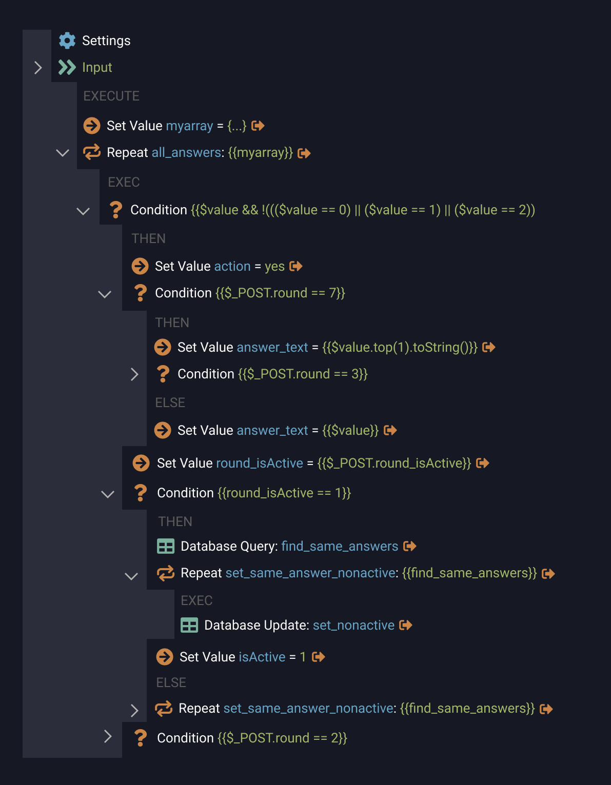
I think it turned out pretty cool.
It is an effective, simple, clean and minimalistic design.
You can easily see: these nodes on first level, these nodes on the second level, etc.
And this design concept is not going too far away from current.
Of course, this concept is working not only for Server Actions. It would be helpful for Page Flow and App Structure as well.
What do you think, guys? Is it better?
(link to this layouts in Figma)
- Like it
- Don’t like it
- Not sure
0 voters
Last updated: