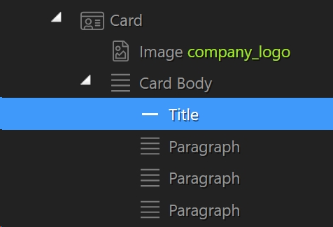
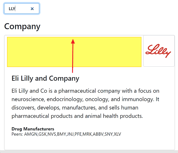
This may not be a Wappler specific question, but I’m having a bear of a time getting my Title and Paragraphs closer to the top of this card body, due to the image causing everything to break to the next line.

Can anyone provide some CSS tips on how I can move this information up so it fits alongside the logo instead of breaking beneath it?
Community Page
Last updated:
Last updated:

