Dynamic attributes in Wappler give you powerful option for dynamically binding attributes like - image sources, href attributes, names, input values etc., as well as show/hide or disable elements on the page, based on specific dynamic condition.
Binding dynamic image source
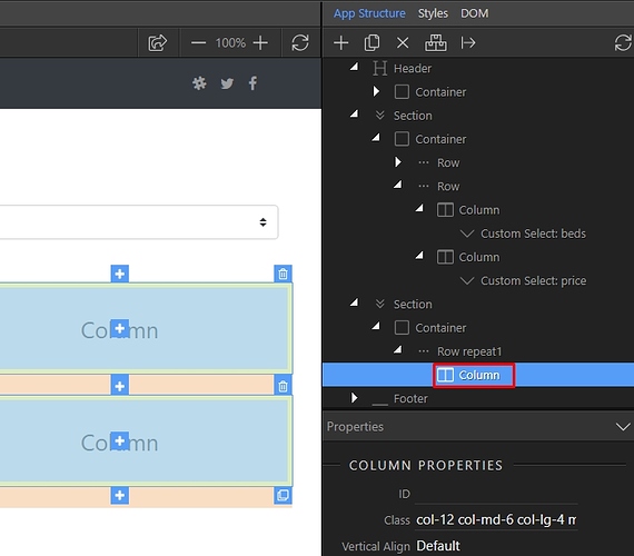
In order to bind a dynamic image source, first you need to add an image on your page. We have a repeat region, which we created from a database query. We right click the element we are repeating:
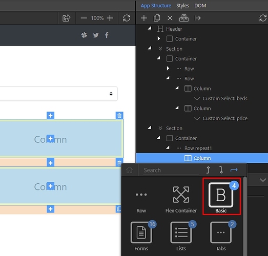
Open Basic:
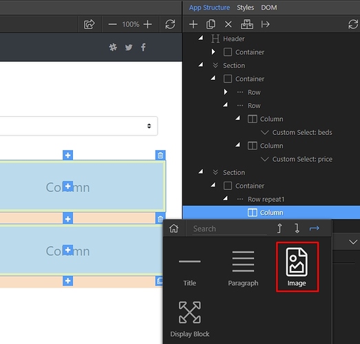
And add an image:
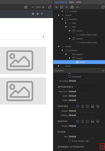
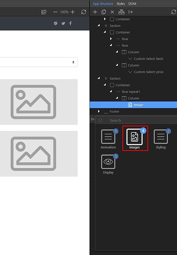
Then select the image and in the properties panel add new dynamic attribute:
Open Images:
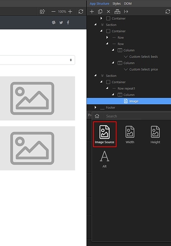
Select Image Source:
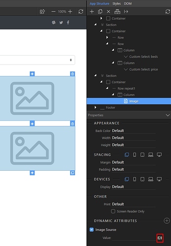
And then click the dynamic data picker button for the image source:
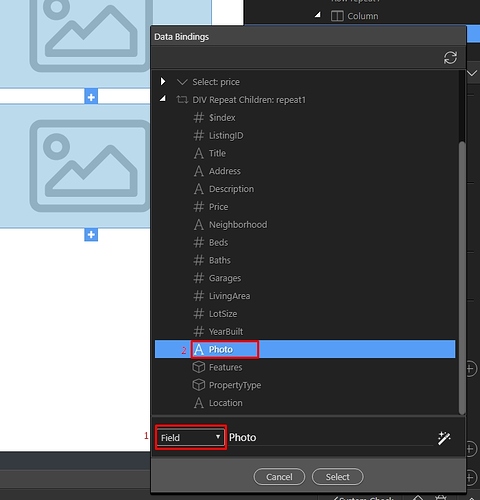
If in your database you store the path to your image, just select Field(1) and click the binding, which returns your image path(2):
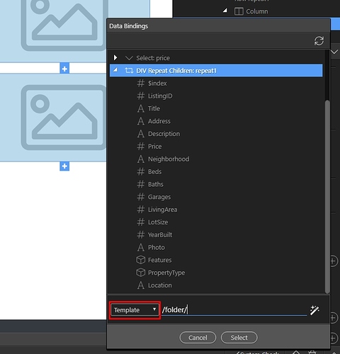
If in your database you store only the image name and you have to manually enter the path to the image location - select Template and manually enter the path to your images:
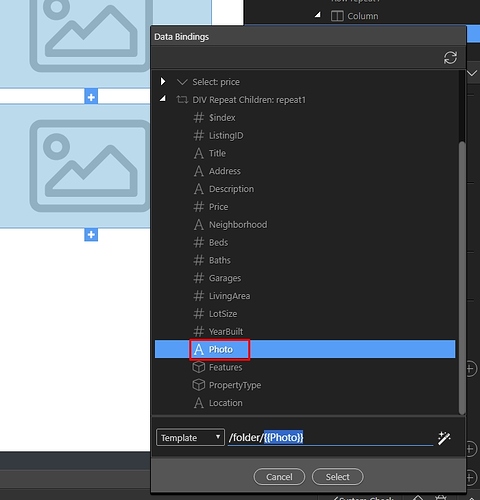
Then click after the path you entered, and select the binding which returns your image name:
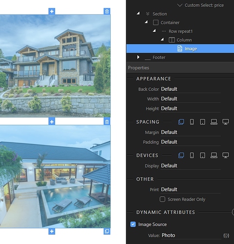
Click select and you are done. You can see your images rendered in Design View:
Creating Dynamic Link
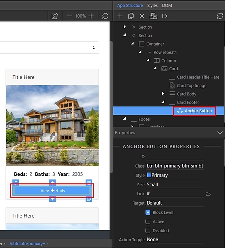
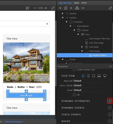
In order to add a dynamic link value you need to select your link/anchor button first, either in design view or in the App Structure:
Then add new dynamic attribute:
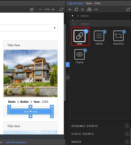
Open Links:
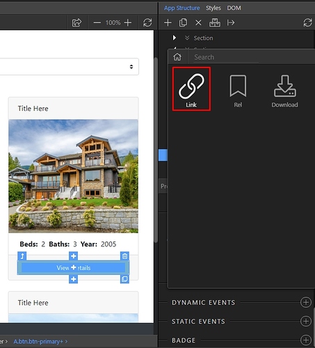
And select Link:
Click the dynamic data picker button for the dynamic link value:
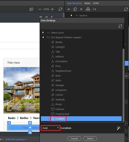
If your dynamic binding returns the whole link, then from the drop-down make sure Field is selected(1) and select your binding:
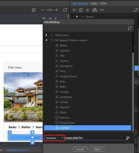
If you need to mix static and dynamic data for the link, i.e. point to a page and pass an URL variable then select Template from the drop-down and enter the static part of your link manually:
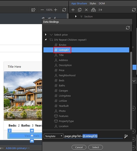
Then click after the static link and select your binding:
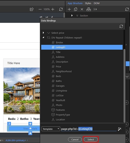
Click the select button:
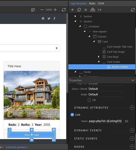
And you are done. Now your links in the repeat region are dynamic, and point to the selected record ID:
Show/Hide Elements with Dynamic Expressions
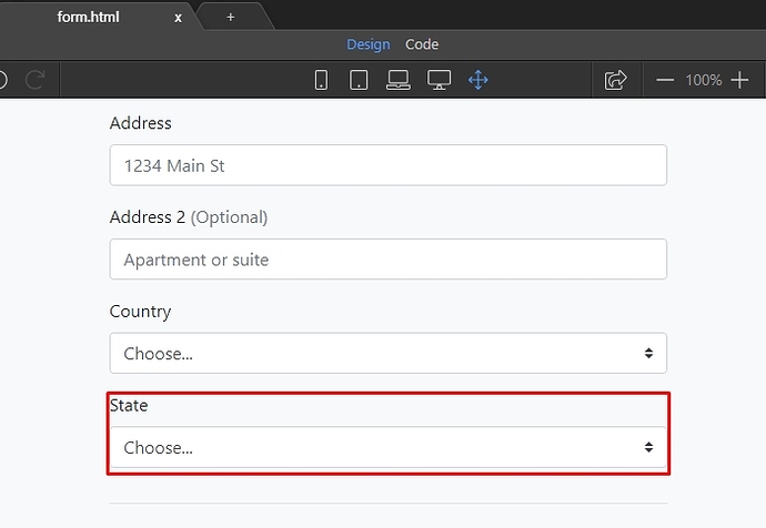
You can show or hide different elements on the page depending different on dynamic expressions. In our case, we want to show the State drop-down only if the selected country is United States:
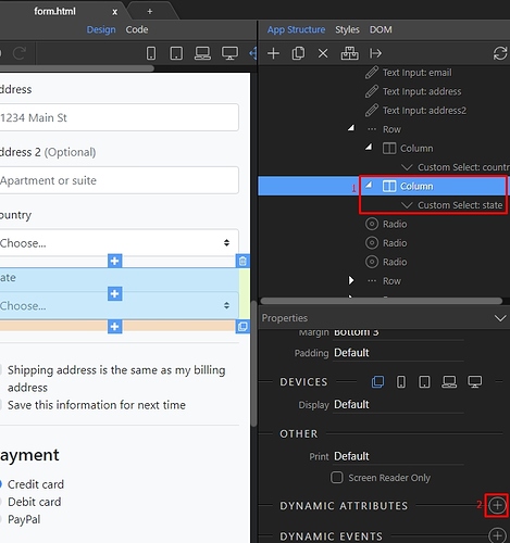
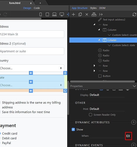
Select the element you want to show/hide(1) and add new dynamic attribute(2):
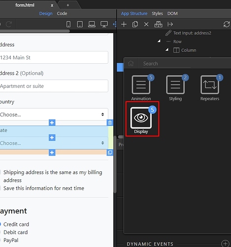
Open Display:
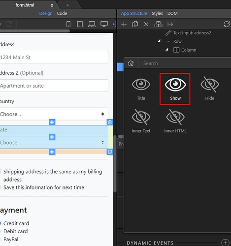
And select Show:
Click the dynamic data picker button, to select when to show the element:
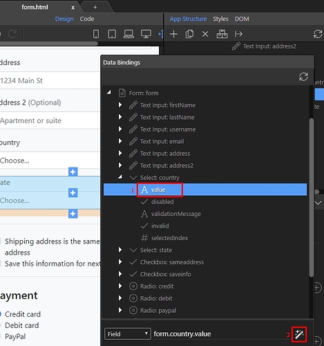
We want the state drop-down to depend on the country drop-down value, so we select value(1) under the country select and then we click the format data button(2):
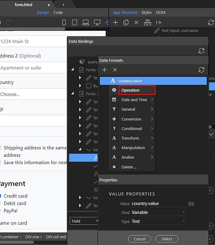
Right click the country.value expression and click Operation:
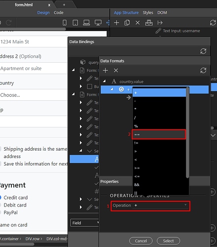
Open the operation drop-down(1) and select == (2):
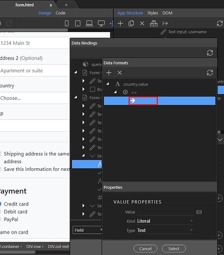
Click the equals to field:
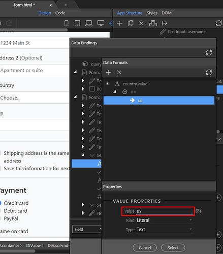
And enter the value, when the state drop-down should be displayed. In our case the value should be - us:
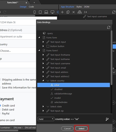
Click Select and you are done:
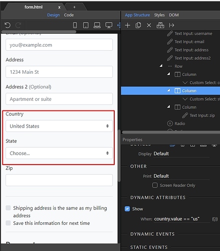
Now the state drop-down will only be displayed, when the country is set to United States:
The same way you can show/hide different elements, defining different expressions.
Dynamic CSS Class
You can apply different dynamic CSS Classes to your elements, depending on different conditions. In our example we will apply a custom class if a value returned by our database query is less than 5000.
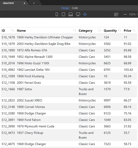
We have a dynamic table, listing our products:
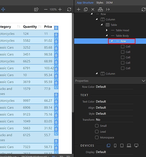
We want to add a custom class to the table row. Select the row:
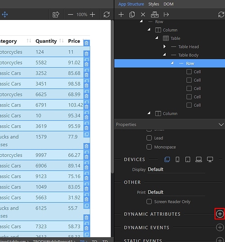
Add new dynamic attribute:
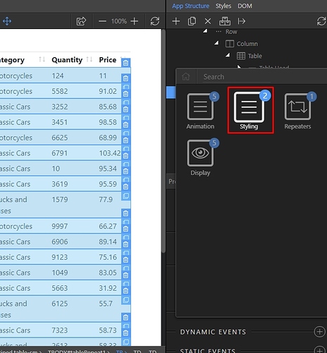
Open Styling:
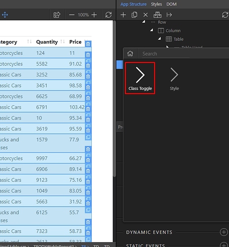
And select Class Toggle:
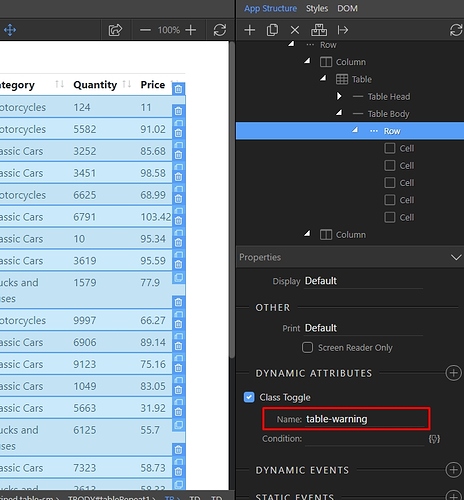
Enter the class name that should be applied:
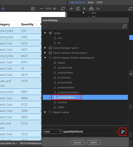
Then click the dynamic data picker button, to setup the condition:
We select the binding which returns the quantity from our database(1) and then we click the format data button (2):
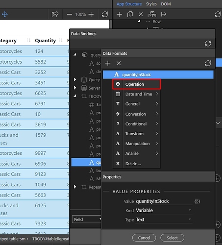
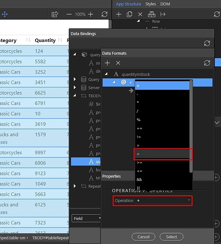
Right click the expression and select operation:
Open the Operation drop-down and select less than <
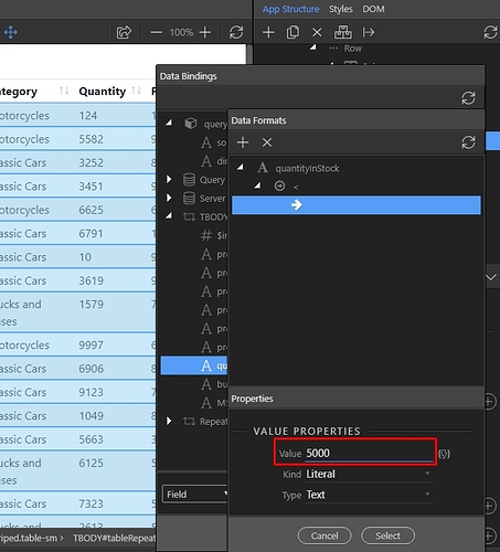
Enter a value to compare with, in our case we want to check if the quantity is less than 5000:
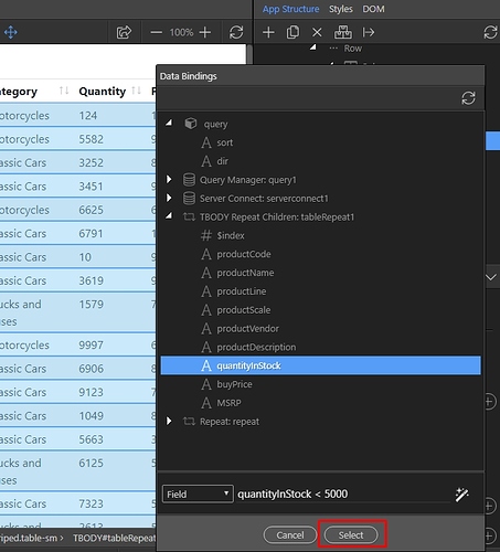
Click Select and you are done:
You can see our custom class applied to the table rows based on the condition we set. This way you can apply multiple classes based on multiple conditions.
Last updated:
