afternoon all,
I am having a weird issue with my background images and I am hoping someone out there has a solution.
The issue I am having is that the background images that I am using for the hero landing pages on the site are not appearing in the correct way. Here is the issue. I have the code written below;
.gecInfoBg {
    background-image: url("../assets/gecBackgrounds/changeWorld.jpeg");
    height: 75vh;
    background-size: cover;
    background-position: 50%;
    background-attachment: fixed;
}
from there the issue is that when viewing mobile the images are extremely zoomed and pixelated. However, when working on them in Wappler they are sized correctly. I have viewed them in chrome, brave, safari and the images are all the same. When viewing them on desk top the look and act correctly.
See the images below.
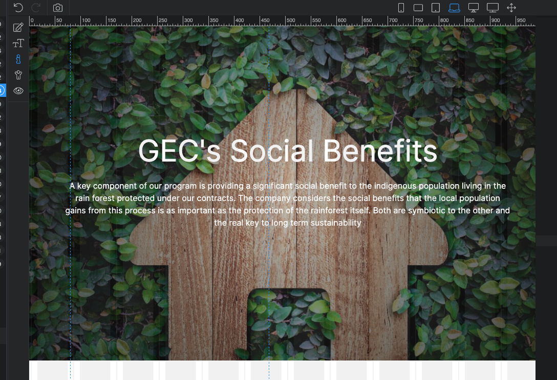
When working in Wappler;
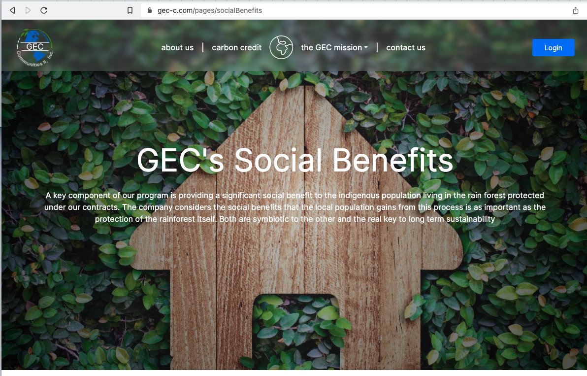
Now when viewing on desktop;
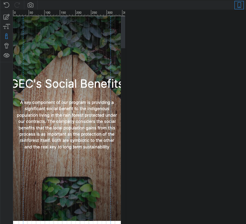
and here is the issue with background images on mobile. Please note, I have viewed them on chrome, Brave, and Safari all the same issue. The other issue is that the image on mobile does not fix position.

Thanks for the help
Last updated: