I’ve just spent some time looking at how to customise the world of input validation in Wappler. It was a bit of a journey, so I thought I’d document what I have discovered so far here to help others and get feedback which may enhance my knowledge!
Client Versus Server Validation
So validation can happen on the client side or the server side. On the client side, the feedback is instant, as the user types. On the server side, the validation occurs when the user clicks on a submit button.
There may be cases where you want one or the other. I’m creating an app that the same people will use day after day, and I don’t want them to be bombarded with messages all the time as they type the same things into the same inputs on a regular basis. In most cases I just want server side validation to remind them when they occasionally missed something out or entered it in the wrong format.
How to use the client side validation is well documented so I will focus more on setting up the server side only validation which I found more tricky to do.
Working With Server Side Validation
Here are the steps you need to make server side validation work:
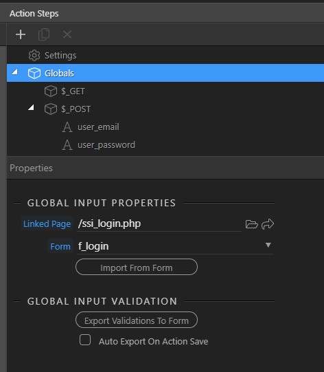
- Server Side - specify which page and which form the server action is to be linked to by clicking on the Globals object:
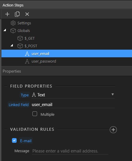
- For each POST input, specify (a) the
nameof the input element that the message applies to in theLinked Fieldfield and (b) the validation rule you require and the message you want to pass to the user.
- On the client side, ensure that (a) the form does not have the
novalidateattribute set. and (b) there are no client side validations set.
Voila, you should get your server side validation message appearing on the client side.
Note that at the time of writing it is not possible to extract the server side message from the database, which you would need if you are designing a multi-lingual system for example. There is a feature request to add this.
Customising the input and message look and feel after validation.
If you haven’t got into the detail of designing your own bootstrap theme, you can use custom CSS to style the results of the validation. For example you may wish to hide the green ticks and red crosses in the input box if there isn’t room for them - I have this issue as parts of my app are financial and my input boxes need to be narrow at times.
Here is the CSS you will need (assuming your inputs have the form-control class):
/* Input element after being shown VALID */
.was-validated .form-control:valid, .form-control.is-valid {
background-image: none !important;
}

/* Input element after being shown INVALID */
.was-validated .form-control:invalid, .form-control.is-invalid {
background-image: none !important;
}

/* the error message produced by bootstrap (if not in a form control group) */
.invalid-feedback { }
And finally, here is the feature request for allowing the server side message to come from the database…
Server Side Validation - Allow Message to Come From Database
Last updated: