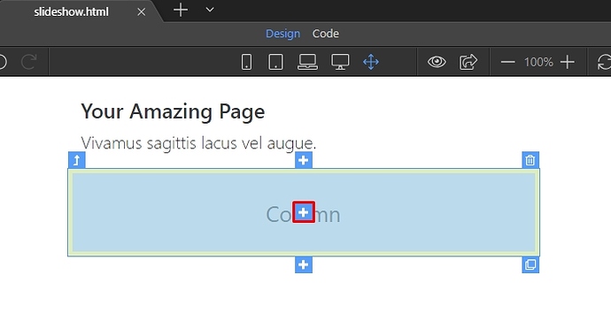
We included App Connect and Bootstrap 4 on our page. Then we created a really simple page layout and we are going to insert it inside a Bootstrap 4 column. The App Connect Slideshow is a responsive slideshow and it takes the width of its parent container.
Click the add inside button:
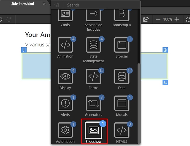
Open the slideshow menu:
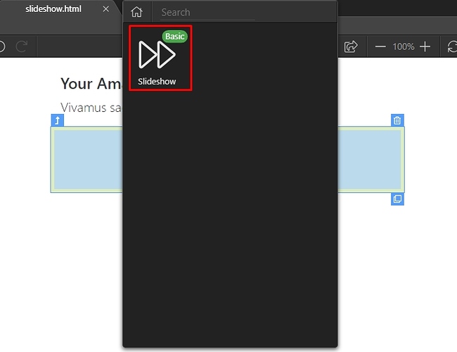
And select slideshow:
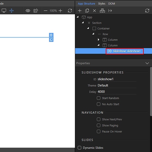
You can see the slideshow component in App Structure. Selecting it will show its options, in the properties panel. Here you can setup the appearance options such as Theme, Delay, Auto/Random Start and Navigation Options:
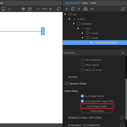
You can import a whole folder of images to the slideshow. This will create a separate slide for each of the images in the source folder. We leave the “Image Resize” and “Auto Generate Image Titles” options on. If you have already resized your images using some image editing software you can turn the image resize option off:
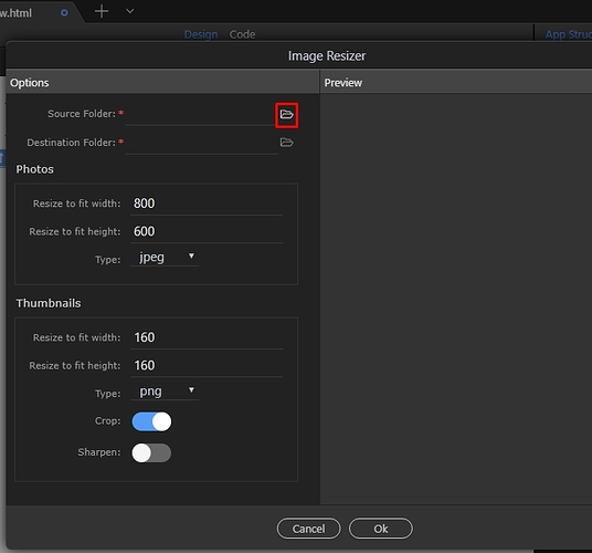
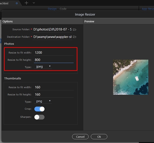
In the image resizer dialog select the source folder for your images. This could be any folder containing images on your computer:
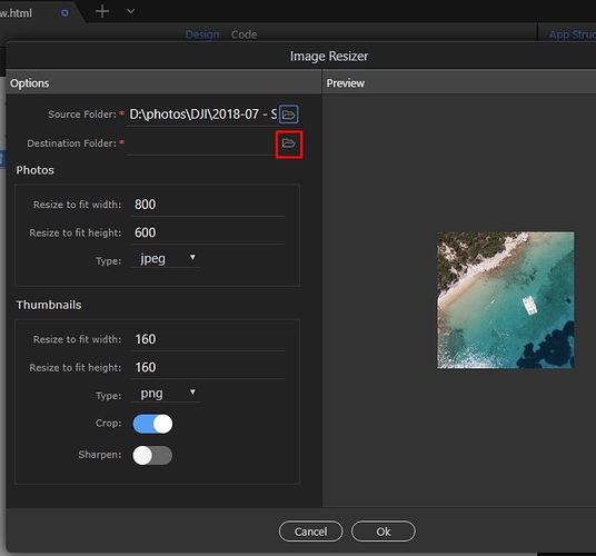
Select the destination folder, where the resized images should be saved.
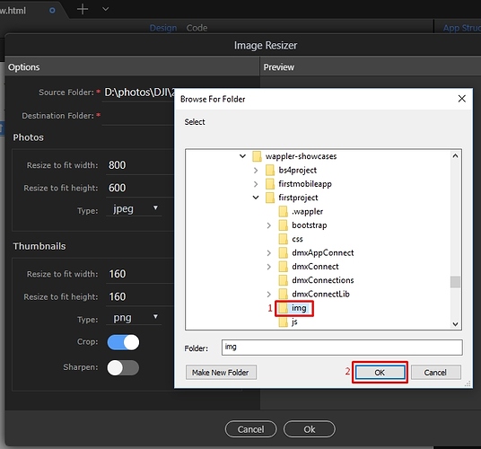
This must be a folder inside your current site folder. Select the folder(1) and click OK(2):
Set the width and height your images should be resized to fit in:
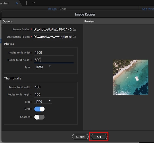
Click OK, when you are done:
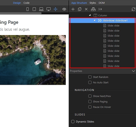
You can see the slides, under the slideshow component in the app structure:
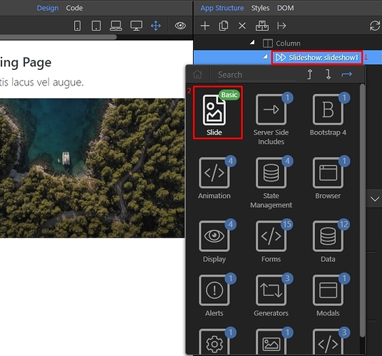
You can also add a separate slide by right clicking the slideshow component, and then selecting Slide:
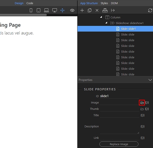
Then just browse to your single image (which should be located in your site folder):
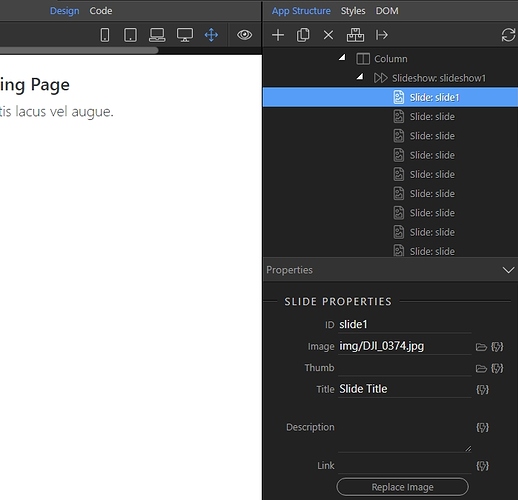
Add some Title and Description, if required:
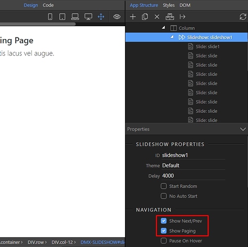
Select the slideshow component, and setup the navigation options - you can show or hide prev/next buttons and paging:
You can preview the results in Design view.
Last updated:
