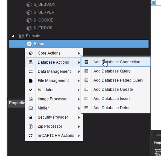
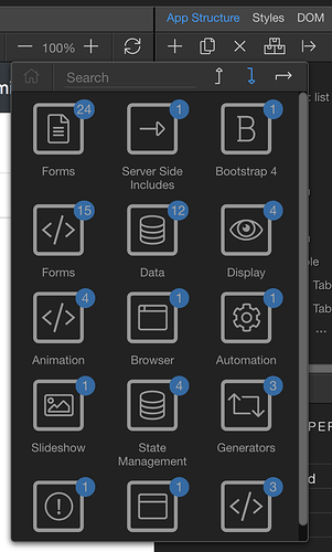
Are the component menus used in Wappler an element of Bootstrap 4 or are they programmed separately and specifically for the app? The reason I’m asking is that I find the classic text menu structuring used in the DMX tutorial videos far more intuitive and less confusing than the relational popup menus (displaying component icons rather than text) used in Wappler.
Soooo… could a future version of Wappler app eventually include a user-select choice of menu style (like Dreamweaver’s Classic, Coder, App Developer, etc.) to accommodate personal preferences?
I prefer this menu structure:
I find this structure unintuitive and confusing:
Just an observation and personal preference for the wish list.
Community Page
Last updated:
Last updated:

