So as we are optimizing our UI in Wappler, I would like to know what will suit you best to do a responsive design.
Currently we have the device selectors on top of design view:
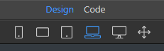
Those indicate the various devices and their size. Yes @psweb we added even the missing one landscape mobile (second) 
So currently those devices only change the design view size, to show you how everything is rendered on that device.
The ideas is actually not to do that only but also switch for edits in that device and up so that every specific changes in the CSS of Bootstrap components are done specifically for the media queries for that device and higher.
Currently we have within the Bootstrap properties also a devices selector:
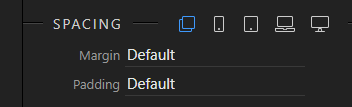
But actually we want to remove it and just use the divice selected above in the design view device selector.
Is that ok to you? Or should we just keep both?
Or maybe you have a better idea? Maybe our @wappler_ambassadors will share their view!
- Yes, provide a single clear global device selector in the design view toolbar
- No, keep both device selectors
- I have other idea, will post in comment
0 voters
Last updated: