So now we are moving more to the grid design of Bootstrap 4
Row Properties
The row properties has being greatly improved and also offer you ready to go presets for the columns inside:
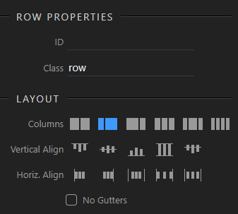
Choosing a columns preset, will auto generate as many columns as selected with the specified alignment.
All those settings are again dependent on device selected in the design view, or valid for all if full size is selected.
Next to the columns preset you can also choose the vertical and horizontal alignments.
Column Properties
When selecting a column, its properties are displayed. The column have a bit more options as each column can have various sizes according the grid or be auto sized:
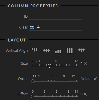
We are offering a extended sliders for easy sizing functionality.
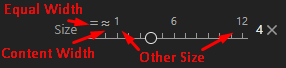
You can either choose from the first few options of the slider as “Equal width”, “Content width” or just size from 1 till 12:
Similar principles apply to the Order and Offset sliders.
Of course tooltips also popup when hovering on the labels of the sliders, so that the options are well explained.
So what do you think? All clear enough for the Bootstrap 4 grid rows and columns?
Last updated: