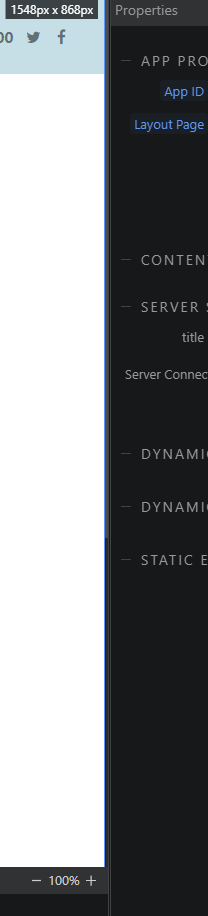
Biggest issue for me applies to all themes, the scroll bars for the panels are extremely thin and do not contrast well with the panel. As a result i find it hard to identify were the scrollbar is and find it really difficult to select. For example, who can spot where the scrollbar is?
Needs to be thicker or in a stronger contrasting shade/ colour.
Community Page
Last updated:
Last updated: