Now that we have stabilized our Electron core for the upcoming Wappler 4, we are now looking forward to add more cool new features and enhancements.
So I will be posting some topics to get your feedback before we start adding those new functions.
A recent request from @JonL to use the system menu. Jon's Wappler UI 4.x personal wishlist - Electron edition
What do you think should we empower the system menu or leave the current one as is?
Initially we made the current menu - to be more in the style of Chrome and also be the same on all OS. This is because on Windows and Linux the regular menu just takes too much space.
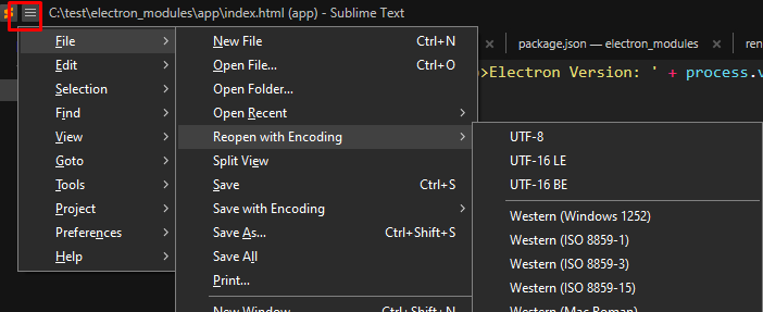
However recent developments on Window, show that it can be done better, like in the recent Sublime version:
On course on MacOS, we will use the default system, as there it is just one shared menu that doesn’t get on the way.
So cast your vote 
- Yes, use system menu on MacOS and drop icon menu on Windows/Linux
- Yes, use system menu on MacOS and also system menu per window on Windows/Linux
- No, leave the current menu as is
0 voters
Last updated:
