Using Bootstrap 5 on a form page.
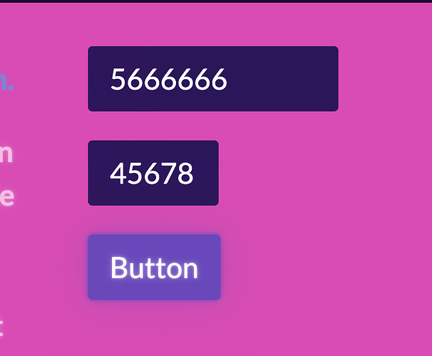
I"m trying to get rid of these value change arrows because the numbers are supposed to be exactly as entered by the user or the form will not let them Log-In. HOW HAVE Developers here tackled this issue?
Especially on smartphones I’m concerned that it is too easy to accidentally with a finger touch accidentally change the number after being typed in. Changing the input type to text would knock those arrows out in browsers but that creates 2 problems – now having to further modify the input to disallow alpha-numeric characters with javascript & the other problem with changing the input to “text” is this –
Because of cellphones that need a popup keyboard the input in my page code has to be type = number.
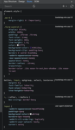
The bootstrap.min.css shows that the properties likely involved in overriding this browser display have to do with webkit and moz appearance.
If my research shows correct CSS solutions then these 2 lines should be enabled.
Here’s one suggestion that got hundreds of green check marks at
```
input[type=number]::-webkit-outer-spin-button,
input[type=number]::-webkit-inner-spin-button {
    -webkit-appearance: none;
    margin: 0;
}
```input[type=number] {
    -moz-appearance:textfield;
}
In my Wappler page using a Bootstrap 5 theme I see in the form-control and input properties lines that should probably be changed to try out this “fix” . . . .
I’m thinking of trying to adapt the above CSS into a binding INLINE style.
CSS experts, have you better solutions?
SOLVED !
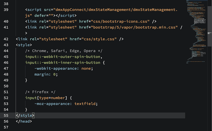
<style>
/* Chrome, Safari, Edge, Opera */
input::-webkit-outer-spin-button,
input::-webkit-inner-spin-button {
  -webkit-appearance: none;
  margin: 0;
}

/* Firefox */
input[type=number] {
  -moz-appearance: textfield;
}
</style>
I put the style in the head of this page to load after all the other bootstrap and general style files had loaded.
Last updated:


