I was asked to make the Notifications a bit more pronounced or obvious, and with a bit more information. I found a very simple way and I thought I would share.
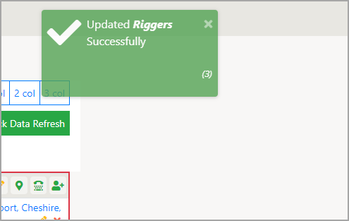
This is the end result

- Larger area
- Bigger ‘Check’ mark (tick)
- Identify the changed item in Bold Italics
- Add a reference for the Notification so it can be identified if changes are needed. Required because there are many Notifications on this page.
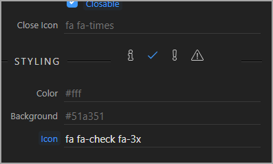
The Check mark is altered in the Styling by adding 'fa-3x'

The dynamic OnSuccess field allows HTML for the other styling.
dmx-on:success="notifies1.success('Updated <b><i>' + people_q_detail.data.people_q_detail_sa.user_nickname + '</i></b> Successfully <br><br><p style=\'font-size: 80%; font-style: italic; text-align: right;\'>(3)</p>')"
Hope this helps someone 
Community Page
Last updated:
Last updated: