I have a contact form I’ve created, with a handful of text input fields. Some of them are required to be filled out.
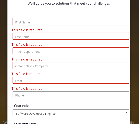
I’ve tested and refined them, they’re working well, with one problem: Wappler is showing the red “This field is required.” title above each field now, in the live (online) version, and in the Design view even when the form hasn’t been used. And worse, injecting the “This field is required.” title messes up the tight form spacing I’ve designed.
Interestingly, the “Required” title goes away when I toggle off App Connect mode… but on the live version, those “Required” titles are still there.
I’ve tried removing the validation, the title is still there. I’ve tried removing the “Message” field for the Required validation rule, still shows up. Attached is a screen with these titles there, for good measure.
Any idea how to get those removed from the Design view, and from the site? I’d prefer to have ticks for validation, which wouldn’t affect the text entry spacing on the form (if I have a choice), but regardless, need to prevent these titles from appearing and affecting the layout / spacing of the form elements.
Thanks in advance for any suggestions!
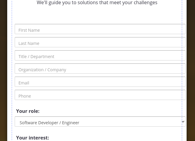
For context, here’s how it should look, how I want it to look, and how it appears in Design mode when the “App Connect” mode is toggled off:

Last updated:
