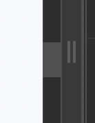
As I approach 112 years now living in front of desktop computer screens I need one particular higher contrast, bolder visual component in the Wappler System themes. I call it a “vertical Scroll Bar control”
vertical Scroll Bar

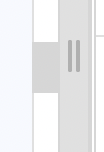
in a lighter theme:

Working for hours in the Wappler screen the system UI is a default low conrast slider control which I have to jump to hundreds of times a day. On top of that I must slide blindly up and down the scroll window with my mouse to locate it wherever it has chosen to go. Only when my mouse pointer is directly ON it will it “light up” – very dimly so.
Changing the System themes does not address this component’s visibility directly.
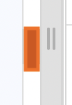
I would like a slider control in whatever System theme that is more instantly visible when I have 3 or 4 columns open in Wappler. So that I can pick that up more quickly for dragging. Like an always contrasting color such as this –

My Mac system UI settings don’t impact this in Wappler. But I have tried the Options with “Use System Accent Color” On and Off. No difference.
Is there a way now that I can modify the size and contrast and color of the Windows Scroll Bar in the Wappler UI?
Last updated: