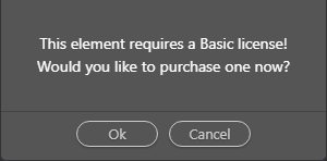
I have finally found a way to get the Free version up and running to see what these users are faced with. The most irritating part that struck me is the fact that just about every component that I click on, I get this pop-up.

This is a real put-off.
To make the program more inviting, it would be nice to have the components that are relevant to the free version, a different colour and/or the components that are not relevant, disabled.
Community Page
Last updated:
Last updated: