I try to make some layouts but getting stuck with small devices. How to handle stuff like that in best practice?
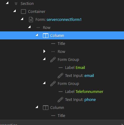
Now i have in my App Structure the following Layoutlogic:
On Big Screen ok:
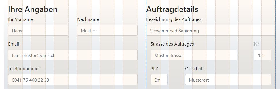
Small is ugly:
With which technique i can do smth? Years ago i used float, left, right, both etc. But I guess thats the wrong way. I guess I can make smaller borders/decrease paddings/margins, but is that the way you go?

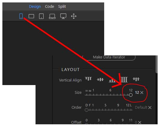
What I use now is for a ROW i have 12 units in Layout (Size).
So i go never more than 12 correct?.
For Example: ROW X
- Column A has : 4
- Column B has : 8
or:
- Column A has : 3
- Column B has : 9
So as I can define columns for each Device Screen for ex. Mobile I define Layout size: 12. Is that right? So small screens break my columns and its fitting the screen?
Community Page
Last updated:
Last updated: