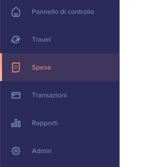
Hi, I am a newbie here. Doing some testing before starting a real project. I want to see if I can make a nicely formatted vertical navigation bar, let’s say more or less like this:

Every row is a unique link. Icons and text are aligned. On mouse over a left vertical bar appears.
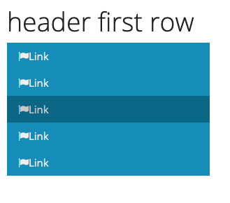
Now let’s see what I have been able to do (please don’t laugh  …):
…):

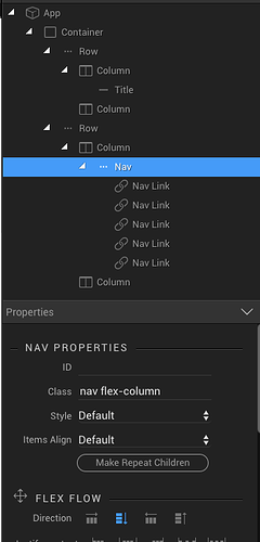
and these are the elements used (as per the tutorial found in Wappler docs):
As you can see the icon (set to prefix) has no distance form text, I was not able to add the left line on hover and I couldn’t vertical align icon and text when increasing their size too.
I know that this is a small single case, but to me it’s important to understand how far can I go with UI design (not being a coder). I appreciate any help and instructions that you can provide. Thanks
Stefano
Last updated:
