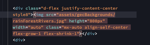
I am sure this is a very easy fix and its because I am a newbie to Wappler but I am having an issue with responsive associated with am full view port image. I have a feeling it is due to the use of the flex container div but the issue is that I want a responsive image as a landing for the website. I have applied these properties to the image;
I want a full vh set to the image but allow for the vw to be centered on the image and when I move from mobile to desktop the image does not responsively change in height. Now I have it set so it does that however the issue is that on mobile or screen size lower than 1400px there is the ability to swipe and move the screen to the right. See the attached images for reference.
Thanks for the help.!
Community Page
Last updated:
Last updated: